How to fix WCErrorCodePayloadUnsupportedTypes Error when using sendMessage

If you are sending data from the iPhone to the Apple Watch, you might use sendMessage.

func sendMessage(_ message: [String : Any], replyHandler: (([String : Any]) -> Void)?, errorHandler: ((Error) -> Void)? = nil)

If you do this and get the error WCErrorCodePayloadUnsupportedTypes this is because you put an unsupported type in the message dictionary.

The first parameter (message) is a dictionary of String to Any, but the value cannot really be any type. If you read the documentation, it says that message is

A dictionary of property list values that you want to send. You define the contents of the dictionary that your counterpart supports. This parameter must not be nil.

“property list values” means values that can be stored in a Plist. This means you can use simple types like Int, Bool, and String and you can also use arrays and dictionaries as long as they are of those simple types (e.g. an Array of Ints)

I ran into this issue because I tried to use a custom struct in the message dictionary, which is not supported.

Note: I made this post because google is sending people to Programming Tutorials Need to Pick a Type of Learner because it mentions WCErrorCodePayloadUnsupportedTypes incidentally, but isn’t really about that.
Pre-define Your Response to the Dashboard

A few days ago, I wrote about using Errors Per Million (EPM) instead of success rate to get better intuition on reliability. I also recently said that Visualizations Should Generate Actions. Sometimes it’s obvious what to do, but if not, you can think through the scenarios and pre-define what actions you would take.

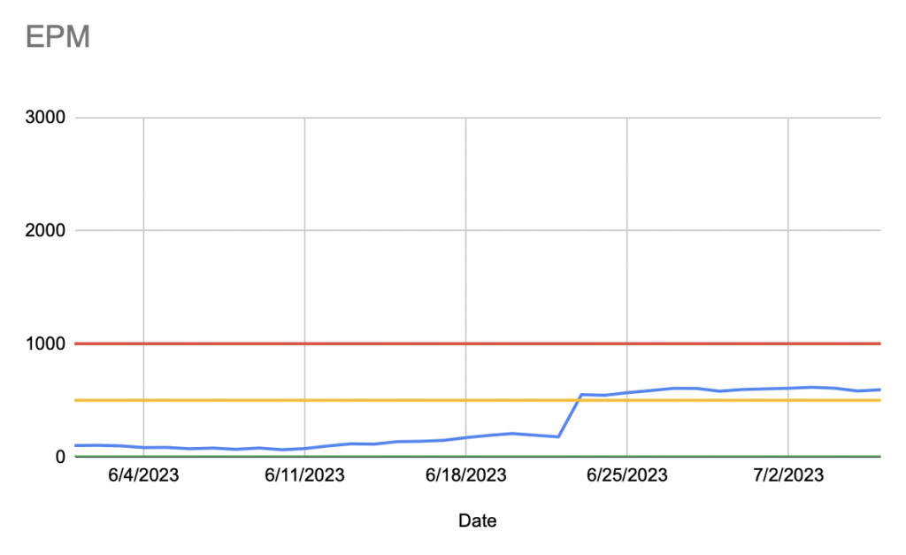
Here’s an example. This is a mock up of what a dashboard showing EPM over time might look like. The blue line is the EPM value on a date:

The three horizontal lines set levels of acceptability. Between Green and Yellow is excellent, between Yellow and Red is acceptable, and above Red is unacceptable. When we did this, we thought about using numbered severity levels (like in the Atlassian incident response playbook), but we decided to use Green/Yellow/Red for simplicity and intuition.

We also pre-defined the response you should have at each level. It was something like this:

LevelResponse
GreenNone
YellowThere must be at least one item in the current sprint with high priority to address this until the level is back to Green. It can be deployed when the current sprint is deployed.
RedAt least one person must be actively working to resolve the issue and doing hot fix deploys until the level is back to Yellow.

The advantage of this was that these actions were all pre-negotiated with management and product managers. This meant that we could just go ahead and fix things (at a certain level) instead of items getting lost in the backlog.

When we created this dashboard, we were in the Red, but we knew that going in. We worked to get ourselves Green and in practice, we were rarely not Green. This is another reason to pre-define your response, as it becomes too hard to remember how to handle situations that rarely happen.

Writing by Speaking

A few weeks ago I wrote about the tools and materials of writing and concluded that using clauses to make interesting, well-ordered, complex sentences was a core skill.

I got this idea from David Lambuth’s book, The Golden Book on Writing [amazon affiliate link]. This is a book a lot like The Elements of Style [amazon affiliate link] by Strunk and White. Like Strunk, he was an Ivy League University English professor and turned his class notes into a pamphlet sized book.

Here’s another gem from the book:

Write down your idea as you would in speech, swiftly and un-selfconsciously without stopping to think about the form of it at all. Revise it afterwards.

I can’t easily write “as you would in speech”, so I’ve been trying to learn by speaking my writing. To be fair, extemporaneous speaking is also difficult, but it does feel like something that I can improve with practice. I talked more about the details in Write While True Episode 20: Extemporaneous Writing.

Costly Signal Theory Applied to Job Applications

If a particular job is your top choice, you should be willing to do more than is necessary to get it. In evolutionary psychology, this is called a Costly Signal.

A costly signal is something we evolved to show genuine fitness in a world where there has been an arms race between deception and deception detection. You prove your fitness to a skeptical evaluator by doing something that is relatively easy for you, but would be too hard for someone less fit. It has to be something that is hard to fake.

Because it can’t be fake, the first step is genuine two-way fitness between you and the job. In a normal job search, it’s likely that you will know this before the employer. So, if you feel like a job would be an excellent choice for you and that you would be the top candidate for it, your behavior should reflect this belief.

The extra work you do should be relatively easy, but not necessarily easy. If it feels like too much work, then that might be an indication that the fit isn’t good. I would caution that some people undervalue themselves. If you have this tendency, then I’d get an opinion from a colleague or mentor of what they think your chances are.

Related articles

Write While True Episode 24: Thousands of Variations

One of the things that got me back to podcasting after a two year break was rereading Art & Fear by David Bayles and Ted Orland.

This time, while I was reading it, I kept a lot of notes and found four themes that resonated with me and helped me get going again.

The first theme is very practical. It’s what they think is the secret to being prolific. For the past two months I have been applying it a lot.

Transcript

When 99.8% Success Wasn’t Very Good

One of my projects at Trello was looking into and fixing a reliability problem we were having. Even though it seemed solid in testing, we were getting enough support tickets to know that it must be worse than we thought. We collected data on its success rate and found out that it was successful 99.8% of the time. To move forward with doing more work on it, I had to convince our team and management that 99.8% was bad.

At the time, there was a company-wide push at Atlassian to improve reliability, and there was a line-manager assigned to oversee it across Trello teams, so I spoke to him. I showed him the data, but also told him that there’s an overall feeling on our team that it’s affecting our customers more than it seems.

He suggested that I flip the ratio and instead look at the data as Errors Per Million. When you do that, with the same data, you get 2,000 errors per million attempts. This particular thing happened around 2 million times per day, so that was 4,000 errors per day. That partially explained the issue, because it wouldn’t take much for the support tickets to get out of control. Luckily, not all 4,000 were of the same severity, and many were being retried. Still, that number is too high.

The other thing I found after more analysis, was that the errors were not evenly spread across the user base. They tended to cluster among a smaller cohort, which was experiencing a much worse EPM than then rest of the users.

With that in hand, we greenlit a project to address this by targeting the most severe problems. We found several bugs. Eventually we got the success rate to 99.95%.

It’s not clear that 99.95% is four times better than 99.8%, but the equivalent EPM after the fixes is 500 (as opposed to 2,000 before). What surprised me is how different a reaction a high EPM got compared to equivalent numbers. 2,000 EPM is literally the same as 99.8% success and 0.2% failure rates, but the latter two seem fine. Even if I say we get 2 million attempts per day, it’s hard to intuitively understand what that means.

When I said 2,000 EPM, we instinctively felt that we failed 2,000 users. When I said we get 2 million attempts, everyone knows to double EPM to get 4,000 incidents per day, and we felt even worse. That simple change in reporting made all the difference in our perspective.

June 2023 Blog Roundup

WWDC was in the beginning of June, so did my usual posts about it

But, the Vision Pro was interesting enough to write about a few more times

I kept up with my Podcast and released every Sunday in June

In episode 23, I talked about how I pre-recorded five podcasts so I could take a break. So, at least I know that the next four will be on schedule in July.

I generally want to write about diagramming more. I am including visualizations in that general theme as well.

Finally, I generally write tips for working as a software engineer. Here are a few more

How I Use JIRA and Trello Together

I started using JIRA for issue tracking when I worked at Trello (at Atlassian), and I still use it now. JIRA does everything I need in managing software projects, but I never send people outside of my team to JIRA because it’s not easy for casual users. For that I use Trello.

I have a Trello board for each project I am managing that is meant to be a high-level summary of that project. It is useful for onboarding and getting its current status easily. It has links to JIRA, Confluence (for specifications), Atlas (for status) and Figma.

This Trello board is the first place I send a new team member to help with onboarding. If someone has a question in Slack about the project, I make sure that it was something you could find out on the board and then link them to it there. The board is a kind of dashboard and central hub of the project.

These hub boards are curated, so I don’t try to use any automations to bring things over. If I think you need more information, I send you directly to the source.

JIRA is useful to the people that work on the project every day. I use Trello for those that just check in weekly or monthly.

Visualizations Should Generate Actions

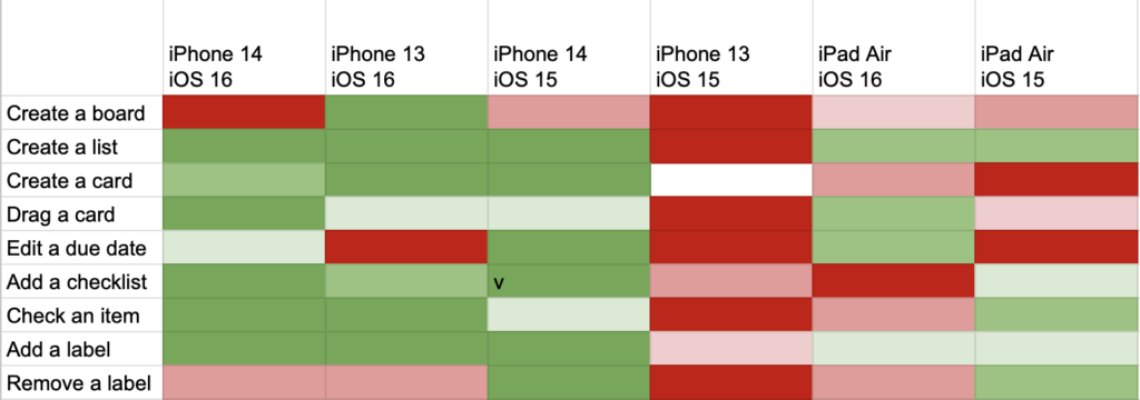
Yesterday, I shared a heatmap visualization that I used to target manual testing time. I chose a heatmap to show this data because you can tell what you need to do just by looking at it.

In this example

A heat map the test status of iOS devices across different features in an app

It’s pretty clear that you should get an iPhone 13 with iOS 15 on it and start testing everything. You could also explore board creation on all devices. If the entire heatmap were green, you would know that you had probably covered most areas.

It would be easy to write a program that took this same data and generated a to-do list instead. Maybe that would be preferable, but people like visual dashboards, and it’s easier to see the why behind the task if you have a sense of the underlying data.

But, that’s a big clue to whether your dashboard visualization works. If you could easily generate a to-do list just by looking at it, then it probably works. If you look at your dashboard and have no response, it might look pretty, but it’s not doing its job.

Use Heatmaps for iOS Beta Test Coverage

At Trello, I built a simple visualization for understanding coverage of our app during Beta periods. We used Mode to analyze data, and so I used their Heatmap.

Here’s a recreation in Google Sheets:

Along the top was each device family and OS. Individual devices were grouped based on how likely they were to be similar in testing (based on size, version, etc). I used this list of Apple device codes (which were logged with analytic data).

Along the left side were the most important screens and features. It was a much longer list that was generated from analytic categories.

The center of the visualization was a heat map based on how much usage that feature got on that device (at the cross-section) normalized against how much usage it got in production. So, if a cell was green, it meant that it was tested a lot when compared to how much it was used in production. If a cell was red, it meant it was under tested.

Often, entire vertical columns would be near red because the combination of device/OS wasn’t used much by our beta testers. So, we could direct our own efforts towards those devices and turn an entire column from red to green.

We also made sure new features would get their own row. These could also be red because beta testers might not know about them. We could similarly target those areas on all devices. These features could not be normalized against production usage (since they were not in production yet), so we use a baseline usage as a default.

Mode kept snapshots of the heatmaps over time. We could watch it go from nearly all red at the beginning of the beta period to more green by the end. I can’t say we could get the entire heatmap to be green, but we could at least make sure we were testing efficiently.