Yesterday, I shared a heatmap visualization that I used to target manual testing time. I chose a heatmap to show this data because you can tell what you need to do just by looking at it.
In this example
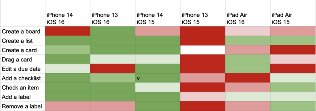
It’s pretty clear that you should get an iPhone 13 with iOS 15 on it and start testing everything. You could also explore board creation on all devices. If the entire heatmap were green, you would know that you had probably covered most areas.
It would be easy to write a program that took this same data and generated a to-do list instead. Maybe that would be preferable, but people like visual dashboards, and it’s easier to see the why behind the task if you have a sense of the underlying data.
But, that’s a big clue to whether your dashboard visualization works. If you could easily generate a to-do list just by looking at it, then it probably works. If you look at your dashboard and have no response, it might look pretty, but it’s not doing its job.