I am going to start building some PlantUML cheatsheets to go with my UML cheatsheets. If you sign up for the diagramming emails, you can get a sequence diagram cheatsheet right now. I’ll notify you when there are more.
Category Archives: Diagramming
PlantUML is Byzantine, but I’m OK With That
When you first see PlantUML for simple diagrams, it looks like just a simple data format. It is not. As you go from diagram type to diagram type, you see lots of alternate syntaxes. For example, any JSON object is a valid PlantUML program. It generates a visualization of the JSON.
More than that, there are mini-languages embedded in some formats. Creole, a simple formatting language, can be used to provide the content for a box in your diagram.
PlantUML also offers a powerful preprocessor with variables, functions, and procedures, loops, conditionals, etc and some diagram types (e.g. C4) are built just with these abstractions.
It seems that whenever the maintainers want to add new features, they seem to lean on more syntax and embedded parsers. The result is both that the onramp can be very gentle to non-programmers because it can look very natural. Here’s a simple sequence diagram:
@startuml
actor User
User -> A: DoWork
A -> A: Internal call
A -> B: << createRequest >>
A <-- B: RequestCreated
User <-- A: Done
@enduml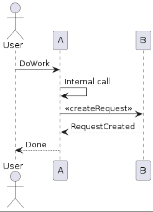
That’s great! If that’s all you want from your sequence diagrams, PlantUML syntax is very nice. I don’t even think I need to explain that syntax. But, as soon as you want more control or extra elements, it gets complicated quickly.
My sequence diagrams all use lifetime bars and show creation and deletion. There is a short-hand for all of that, and here’s an example from the reference guide.
@startuml
alice -> bob ++ : hello
bob -> bob ++ : self call
bob -> bib ++  #005500 : hello
bob -> george ** : create
return done
return rc
bob -> george !! : delete
return success
@enduml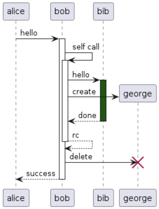
It’s still manageable. But, it goes deeper and deeper. It’s hard for me to imagine that there’s a sequence diagram I’d want, but couldn’t get. But, there’s a lot of random, seemingly unrelated stuff I’d need to learn to get it.
I’m ok with that, because I want diagrams-as-code more than I want simple code. And I know that most of the time, the code isn’t that bad.
When to Code a Diagram
I’ve been porting all of my draw.io diagrams in Confluence to PlantUML. Both tools meet my minimum requirements for diagrams in documentation.
- The diagram must be editable inline in the document
- The diagram elements must be able to be links
- The diagram doesn’t need to look perfect, but it can’t be wrong.
It’s come down to Draw.io and PlantUML, which are very different from each other. Draw.io is a typical point-and-click drawing program. It’s web-based, and about as good as that can be. PlantUML is a programming language for creating diagrams. The editing experience is a text editor side-by-side with the rendered diagram. Both Draw.io and PlantUML can do my minimum list, but there are some things that are making me favor PlantUML.
- I’m documenting, not designing. I’m not trying to figure out the system I am documenting—I am just trying to communicate it quickly at the top of a document that goes into details. If I were still designing, I probably would want to draw, but honestly, it’d be on paper or with freeform drawing tools.
- I accept the default layout engine. In PlantUML, it’s best if you let the layout engine do it’s thing. I’m still learning how to influence it, but try not to worry about it too much.
- I’m comfortable with programming languages. PlantUML is a weird programming language with syntax affordances for diagramming and other embedded mini-languages. Simple diagrams are simple, but I find that I need the more advanced features for all of my diagrams.
- I like the idea of version control and diffing. It’s text, and line-oriented, so it works well with diffing.
- I could generate this. I love to generate code and so learning this will ultimately lead to me generating it some circumstances.
- I can edit quickly. If I want to fix a typo, I don’t have to click-click-click to get to the part where I can type. The text editor is very good. Also, I can easily copy and paste from other diagrams and samples.
- I can make my own library. Drawing tools let you make template shapes, but PlantUML is a programming language (with conditionals, loops, math, etc). The tools it has for abstraction are way beyond what drawing tools typically do.
I might just be repeating what the diagrams-as-code people have been saying all this time, but until PlantUML, I hadn’t used anything that was good enough to get these benefits (because they didn’t meet the minimum).
PlantUML for Confluence
When I wrote C4 Context Diagrams in GitHub READMEs to show how to use GitHub’s support for Mermaid diagrams, I was disappointed with the output. One of the nice things about the Diagrams-as-Code movement was that the default layout should be good enough. I found that even simple diagrams looked bad by default, and I had to spend too much time to make them look good. To be fair, I think C4 support is still in beta.
I’m mostly interested in C4 diagrams in my documents, and for that, Mermaid supports PlantUML syntax. I wanted to try PlantUML, but I assumed that the rendering would be similar to Mermaid. I was wrong.
My documentation is in GitHub for open-source projects, but for private projects, I use Confluence. I found the PlantUML for Confluence plugin from Stratus and ported one of my system context diagrams. It took a few minutes and 13 lines of code—one for each component and one for each relationship. The default layout was fine.
The rest of my diagrams are more complex. I’ll be porting them over the next few days.
Don’t Let Content Dictate Size in Diagram Elements
A couple of days ago, I wrote about the visual variables in graphic design as applied to diagramming. I showed this UML diagram:
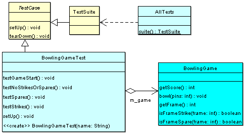
One thing to think about in diagrams is how the size of an element is determined. In many cases, a shape’s size is dictated by its content, which can mislead the viewer on the relative importance of boxes.
I created this diagram for a talk I gave on unit testing, which is why it includes the unit testing library classes. In the talk, the most important class was BowlingGameTest, so it’s ok that the class is the largest one.
But, that was not intentional. BowlingGameTest is the biggest box because it has the most methods.
In the real system, BowlingGame is a much more important class. If this diagram was meant to give an overview of the system, you would want to make sure that the BowlingGame box was the most prominent. If your tool didn’t let you set size independent of content, then it would be better to leave out test methods so that the test class box was smaller.
How to Use Visual Variables to Emphasize Elements in a Diagram
In graphic design, there’s the concept of visual variables. For each element of a design, you can set its: Position, Size, Orientation, Hue, Value / Brightness, Texture / Pattern, and Shape.
By varying these variables between elements, you impart information. For example:
- Elements of the same color should be related in some way.
- Elements of different colors, but the same hue, might have a more broad relation.
- Elements that are close together should have a relationship related to location. Ones that are further apart should be further in that location.
You can learn more about this in these two books:
- The Elements of Graphic Design [amazon affiliate link], by Alex White (more about classic graphic design)
- Designing Visual Interfaces [amazon affiliate link], by Mullet and Sano (more about computer user interfaces)
These variables also apply to diagramming. Maybe even more so because the entire point of a diagram is to impart information, where in a graphic design piece, like a poster, you have other considerations.
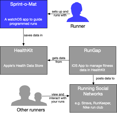
For example, in this C4 Context Diagram
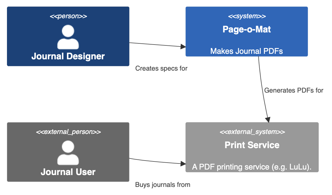
- Blue hues are for things that are internal to the system
- Gray hues are for external elements
- Dark values are users, lighter values are for software
- Figure shapes are used to indicate users
In this UML Class diagram:
- Hue is being used to indicate library elements (yellow) vs. classes in our system (cyan)
- Lighter colored boxes are tests and the darker one is a class in the product
So, if you want to make an element more prominent, you could use a subset of the variables to do that:
- Use position to set it in the center with other elements around it
- Use size to make it bigger and other elements smaller
- Use rotation (sparingly) to make an element stand out as compared to others
- Use a different hue for the most important element
- Set its brightness at the extreme (darkest or lightest)
- Give it a distinctive pattern
- Give it a distinctive shape
In standardized diagrams or in editors that impose a layout algorithm, you might have limited control of all of the variables, but since there are so many options, there is usually something you can do.
The System Boundary is Defined by the External Pieces
In a C4 System Boundary diagram, you start by drawing a blue box in the center. That’s your system. And you draw some blue stick figures with arrows pointing at that box. Those are your users.

Every system in the world pretty much looks the same if you stop there. Put some words on the parts to make it more specific.

But this diagram is called a Context diagram for a reason. The most important part is not the system box (the three other types of C4 diagrams will elaborate on it), but the all of the gray boxes and stick figures you put around it.
These are the external pieces that are not the system and who are not your users. They are out-of-scope, but do a lot of work in the diagram to help describe the system.
C4 Context Diagrams in GitHub READMEs
I discovered C4 diagrams two years ago and I’ve been using them in my private projects since then. I use Confluence for all of my project documentation, so I’ve been using the draw.io add-on to make the diagrams because that’s the best solution I’ve found that lets me edit the diagrams inside of the document.
As I wrote in Towards a Portfolio Based Interview Process for Programmers, when describing what a GitHub portfolio repository should look like:
I could use an orientation. I need a starting place. The bigger the project, the harder it will be to jump in and take a look around. Give me what you’d give a new contributor.
The purpose of a context diagram is to explain the boundaries of your system. You do this by representing your system as a single box in the center and surrounding it with your various user roles and collaborating systems (see more on the C4 site).
To put one in a README, you could use mermaid’s C4 support for context diagrams. This support is experimental (in May 2023), so it’s very hard to get a good diagram. I am personally finding it impossible to get anything more than simple diagrams to look good enough.
To give an example, here is some code that I used to add a context diagram to the Page-o-Mat README (here’s a link to the commit in case I change it later).
C4Context
  %% This is a Mermaid diagram for the system context
  Person(designer, "Journal Designer")
  System(pageomat, "Page-o-Mat", "Makes Journal PDFs")

  Person_Ext(journaler, "Journal User")
  System_Ext(printservice, "Print Service", "A PDF printing service (e.g. LuLu).")

  Rel(designer, pageomat, "Creates specs for")
  Rel(pageomat, printservice, "Generates PDFs for")
  Rel(journaler, printservice, "Buys journals from")

  UpdateLayoutConfig($c4ShapeInRow="2", $c4BoundaryInRow="1")
  UpdateRelStyle(designer, pageomat, $offsetX="-40", $offsetY="40")
  UpdateRelStyle(journaler, printservice, $offsetX="-40", $offsetY="40")
It looks like this:

You can see that color is being used to indicate which parts of the entire system are in scope for the project.
If that’s too frustrating to use, then I suggest MonoDraw for making an ASCII Art version. The downside is that this diagram is hard to edit, but a context diagram doesn’t change much. Another small issue is that you can’t use color. I can live with just text tags (in <<>>) for that because it saves me having to add more files to the repo for diagrams.
For Diagramming, Favor in-Document Editing
I made my UML Cheatsheet using OmniGraffle. I also used it for all of the diagrams in my book, Hello! iOS Development. It is an excellent diagramming tool that I recommend wholeheartedly, but I find that I can’t use it for my software project documentation.
All of my projects are documented in either Confluence, markdown files, or as source comments. The only way to use diagrams I make with OmniGraffle is to attach them somehow, usually as an exported PDF or image. When I read the document, this is fine, because the diagram will be shown inline.
But it’s missing two very important features
- I can’t make the diagram interactive. The main thing I want is for the various boxes to be links to the text documentation or other diagrams.
- I can’t edit the diagrams. I’d need to go back to OmniGraffle, find the source document, edit it, and then re-export it and get it to the document editor.
That second point is a deal-breaker for me to the point that I am dealing with diagramming software that is a lot worse than OmniGraffle just because I can edit the diagrams inline.
For Confluence, I am using the draw.io add-on [UPDATE: in Sep 2023 I moved to PlantUML]. Its main drawback is that it’s web-based, but of course, that’s the only way in-doc editing could work in Confluence. OmniGraffle is amazing because it’s a native desktop app written by one of the premier (if not THE premier) native macOS application development shops. I respect what the draw.io team has done in a browser, but it’s frustrating to use compared to OmniGraffle.
For Markdown, I started with MonoDraw, which is a native diagramming app that produces Ascii Art diagrams (good for embedding in source and Markdown), but again, not editable in the document. Once I saw that GitHub supported mermaid directly, I started to move over to it, even though it’s very limited. But I can make the diagrams I need (or close enough).
But, in-doc editing trumps everything for me. Without it, editing the diagrams has too much friction, and I risk them becoming out-of-date.
Consider C4 for Systems Interviews
I recently ran into the C4 model for visualizing software architecture. It’s simple and notation agnostic (meaning, you don’t need to learn the meaning of arrow heads).
One of the things I noticed in giving systems interviews is that the interviewee didn’t have any kind of coherent way to visualize their system. So, it was hard to understand what they were saying.
The benefit of C4 is that it’s just slightly more organized than doing nothing. It also asks that you provide a key/legend for any notation choices you make.
I think that most of the benefit comes from the suggestions to use more text. For example:
Boxes have a name, type, and a short description. Think of it like this: NAME is a TYPE that DESCRIPTION.

Arrows form a sentence when read as “BOX A” — “arrow text” –> “BOX B”.
The idea is that the diagrams are stand-alone and are mostly organizing short text snippets.
They are also hierarchical—meaning that if I need more information, there would be possibly be a set of sub-diagrams for each box. Without C4, I think many people would just have the boxes with just the names (titles) and unlabeled arrows.
The metaphor is a map that starts zoomed out and gets more and more detail as you zoom in.
I am mostly suggesting this as a sketching/communication visualization using a whiteboard. But if you are trying to do C4 to keep real diagrams, then generating them from some kind of DSL is much better. PlantUML provides a free solution, and the author of C4 has a freemium solution called Structurizr.