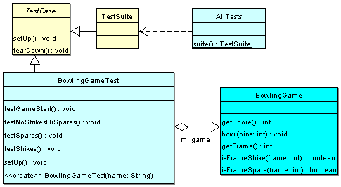
A couple of days ago, I wrote about the visual variables in graphic design as applied to diagramming. I showed this UML diagram:

One thing to think about in diagrams is how the size of an element is determined. In many cases, a shape’s size is dictated by its content, which can mislead the viewer on the relative importance of boxes.
I created this diagram for a talk I gave on unit testing, which is why it includes the unit testing library classes. In the talk, the most important class was BowlingGameTest, so it’s ok that the class is the largest one.
But, that was not intentional. BowlingGameTest is the biggest box because it has the most methods.
In the real system, BowlingGame is a much more important class. If this diagram was meant to give an overview of the system, you would want to make sure that the BowlingGame box was the most prominent. If your tool didn’t let you set size independent of content, then it would be better to leave out test methods so that the test class box was smaller.