Dates and Integers have a natural ordering. We all agree that January 1st is before January 2nd and ten comes after nine. But, there is no natural ordering for things like vectors, complex numbers, and matrices because they are multi-dimensional. Unfortunately, most things in real life are multi-dimensional.
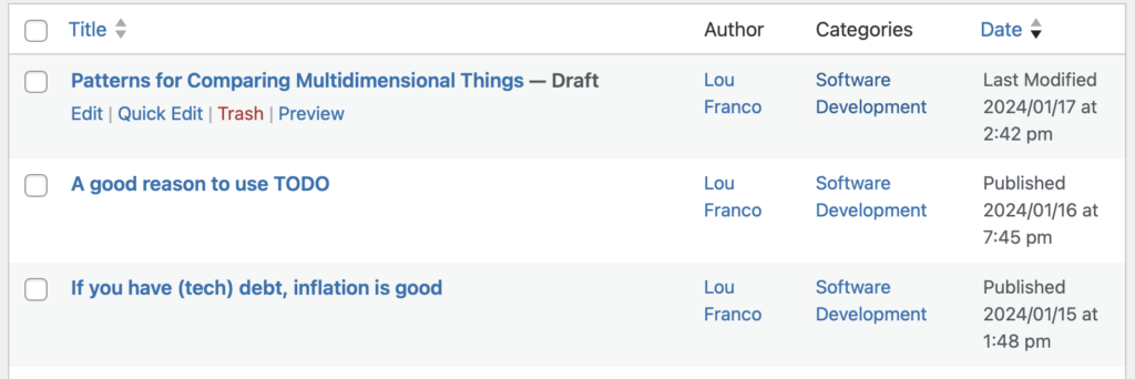
A common way to deal with ordering a list of things in software is to put their attributes in different columns. You see this in email clients, spreadsheets, and lots of other software. Then, when you click on a column, the list is sorted by that attribute. You can explore various orderings for different contexts. Some might be more useful—for example, in my WordPress backend, I sort my posts by reverse chronological date. But, it’s valid to sort them by title if you need to. Good versions use the previous sort choice as a sub-sort that breaks ties in the main sort.
Another way is to come up with some kind of function of the attributes that results in a single-dimensional attribute that is easy to compare. One that I’ve seen on flight search websites is an “Agony” score that takes into account the number of stops, the price, and the departure time. You could sort by ascending agony and hopefully see the best choice that considered all of the variables, rather than just sorting on price.
I do something like this in my iOS app, Habits. For each habit, I look at your entire history with the habit. I weight recent adherence more than the past and try to come up with a score normalized between 0-100. My intent is that you can use that to compare how well you are doing on different habits.
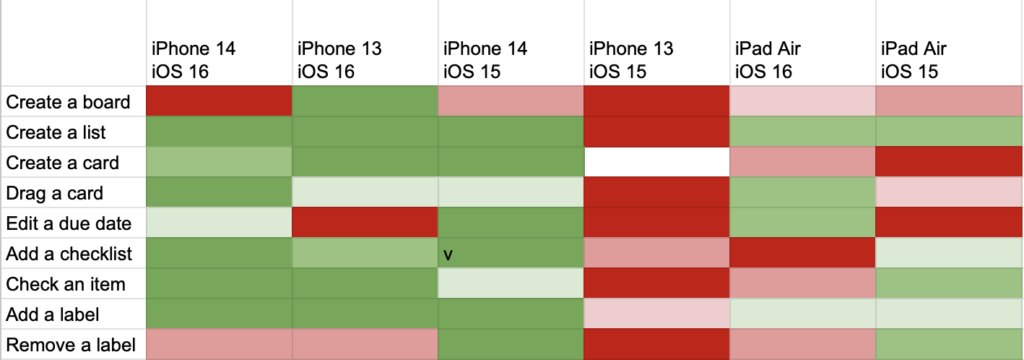
A third way is to map attributes to elements of a chart. One attribute could be the x-axis and another could be the y-axis. You could map one attribute to the size of a dot and another to color along a gradient. If your x and y are categories rather than a continuous value, you might end up with a heatmap. This heatmap compares the amount of testing done on different iPhones and iOS versions.
For continuous axes, you might end up with a chart like this one you can generate with chartjs:
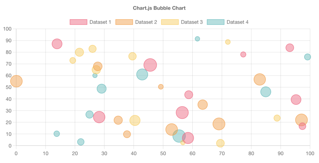
In that last chart, it matters which attribute you map to which chart element. It’s often the case that we filter for just the upper-right quadrant, so the x and y would override color and size. You might want to rotate through different choices of the mapping.
Lastly, you could generate radar charts for each thing. Putting the attributes along a multi-dimensional graph like this one:


This works well when you want to combine things to form a balanced whole. By overlaying two radar graphs, you can see if the combination is complementary.

But, you could also get a sense of an ordering. You could calculate the covered area, which is function of the attributes. You could size the spokes and normalize the data on them to express a priority and to dampen the effect of outliers.
I’m thinking a lot about multidimensional comparisons as I consider ways to prioritize projects. I’ll be writing more about this soon.