At Trello, I built a simple visualization for understanding coverage of our app during Beta periods. We used Mode to analyze data, and so I used their Heatmap.
Here’s a recreation in Google Sheets:
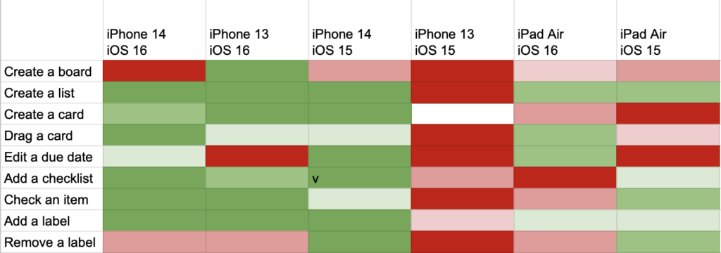
Along the top was each device family and OS. Individual devices were grouped based on how likely they were to be similar in testing (based on size, version, etc). I used this list of Apple device codes (which were logged with analytic data).
Along the left side were the most important screens and features. It was a much longer list that was generated from analytic categories.
The center of the visualization was a heat map based on how much usage that feature got on that device (at the cross-section) normalized against how much usage it got in production. So, if a cell was green, it meant that it was tested a lot when compared to how much it was used in production. If a cell was red, it meant it was under tested.
Often, entire vertical columns would be near red because the combination of device/OS wasn’t used much by our beta testers. So, we could direct our own efforts towards those devices and turn an entire column from red to green.
We also made sure new features would get their own row. These could also be red because beta testers might not know about them. We could similarly target those areas on all devices. These features could not be normalized against production usage (since they were not in production yet), so we use a baseline usage as a default.
Mode kept snapshots of the heatmaps over time. We could watch it go from nearly all red at the beginning of the beta period to more green by the end. I can’t say we could get the entire heatmap to be green, but we could at least make sure we were testing efficiently.