A few days ago, I wrote about using Errors Per Million (EPM) instead of success rate to get better intuition on reliability. I also recently said that Visualizations Should Generate Actions. Sometimes it’s obvious what to do, but if not, you can think through the scenarios and pre-define what actions you would take.
Here’s an example. This is a mock up of what a dashboard showing EPM over time might look like. The blue line is the EPM value on a date:
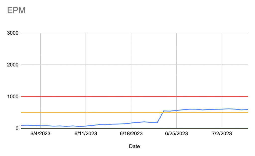
The three horizontal lines set levels of acceptability. Between Green and Yellow is excellent, between Yellow and Red is acceptable, and above Red is unacceptable. When we did this, we thought about using numbered severity levels (like in the Atlassian incident response playbook), but we decided to use Green/Yellow/Red for simplicity and intuition.
We also pre-defined the response you should have at each level. It was something like this:
| Level | Response |
| Green | None |
| Yellow | There must be at least one item in the current sprint with high priority to address this until the level is back to Green. It can be deployed when the current sprint is deployed. |
| Red | At least one person must be actively working to resolve the issue and doing hot fix deploys until the level is back to Yellow. |
The advantage of this was that these actions were all pre-negotiated with management and product managers. This meant that we could just go ahead and fix things (at a certain level) instead of items getting lost in the backlog.
When we created this dashboard, we were in the Red, but we knew that going in. We worked to get ourselves Green and in practice, we were rarely not Green. This is another reason to pre-define your response, as it becomes too hard to remember how to handle situations that rarely happen.