The System Boundary is Defined by the External Pieces

In a C4 System Boundary diagram, you start by drawing a blue box in the center. That’s your system. And you draw some blue stick figures with arrows pointing at that box. Those are your users.

An empty blue box next to blue human shape. An arrow is pointing from the human to the box.

Every system in the world pretty much looks the same if you stop there. Put some words on the parts to make it more specific.

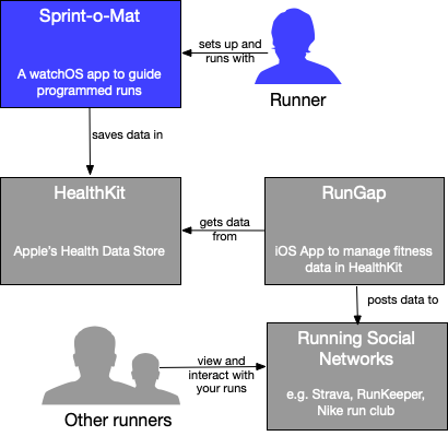
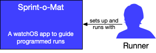
A blue box next to blue human shape. An arrow is pointing from the human to the box. The blue box says "Sprint-o-Mat: a watchOS app to guide programmed runs" and under the human is a caption "Runner". An arrow points from the human to the box and says "sets up and runs with". This is the system in a context diagram.

But this diagram is called a Context diagram for a reason. The most important part is not the system box (the three other types of C4 diagrams will elaborate on it), but the all of the gray boxes and stick figures you put around it.

A blue box next to blue human shape. An arrow is pointing from the human to the box. The blue box says "Sprint-o-Mat: a watchOS app to guide programmed runs" and under the human is a caption "Runner". An arrow points from the human to the box and says "sets up and runs with". This is the system in a context diagram.

Under that are gray boxes that say HealthKit, RunGap and Running Social Networks. These are external context systems. There is a gray set of humans that say "other runners" The diagram show the relationship between them.

These are the external pieces that are not the system and who are not your users. They are out-of-scope, but do a lot of work in the diagram to help describe the system.

Metrics that Resist Gaming

The other day I described CRAP, which is a metric that flags code that is risky to change. I suggested that if you need to change that code, you start with tests and refactoring.

Tests and refactoring are positive to the codebase and improve the readability of the PR they are in, which is why I like CRAP as a metric—it’s hard to game.

In contrast, Story points (and velocity based on it) are the exact opposite.

Story points are completely made up numbers that have low accountability. Velocity is just points-over-time, so it’s also made up. If a team must improve velocity (for their manager), the easiest thing to do is to over-estimate the points per task and like magic, velocity can meet any target. I don’t think engineers would do this consciously, but this is just a known phenomenon of metrics (see Goodhart’s Law).

This is one of the reasons I don’t use Story Points. But to be honest, almost any estimation technique is ripe for gaming (ala Scotty from Star Trek).

When I wrote about DevEx, a new developer productivity methodology, I wrote that I thought that they “do help engineers deliver software better and faster”, but that they are most useful to the team itself (not stakeholders).

Looking over that article I realized that the thing I like about these metrics is that they are hard to game. If I get several 3-hour blocks of uninterrupted coding time per week, then I am sure I can write more and better code than if I didn’t. Counting lines of code (and judging its quality) is fraught, but hours of uninterrupted time is easy to count and more is better.

If you are worried that coders will shirk other duties (like code reviews or attending meetings), there is another metric to measure feedback loops, which is in tension to the flow metric.

My main critique of DevEx still stands—it’s not something to report outside of the team. But the more I think of it, the more I like it and will try implementing it on my (1-person) team.

My New Podcast Generating Workflow

In Accessibility First in Podcasts, I wrote that since my podcasts are scripted, I don’t have to work hard to get a transcript.

But I found that writing a script was both hard and resulted in a podcast that sounded written. Even if I memorize and perform it well, it didn’t sound like my spoken “voice”.

So, I decided to

  1. Start with a rough outline
  2. Make a recording of a lot of extemporaneous speaking on the subject
  3. Make a transcription of the recording using Whisper from OpenAI
  4. Edit the transcription into a coherent story, but try to preserve the phrasing
  5. Practice it
  6. Make a recording that basically follows the script. It’s ok to make mistakes, rephrase, or veer off.
  7. Edit the recording to remove mistakes and reduce overly long pauses
  8. Listen to the recording and fix the script so it’s now a transcript.

The key thing is step #4 which helps me make a script that sounds like me talking (not writing).

Use Your First Commit to Fix CRAP

The CRAP metric combines cyclic complexity and test code coverage to flag functions that are both complex and under tested so that you can see which functions are risky to change.

There are extensions for many IDEs to get you the metric directly or that will show the parts (test coverage and complexity). But you don’t really need them, because you know CRAP-y code when you see it—run unit tests to see if the function is under test and eyeball the complexity by counting up the branches and logical sub-expressions—you can stop counting at about four, because more than that is probably CRAP.

So, if you have to change a CRAP-y function, you could start the PR by trying to lower the score.

The first step to reduce CRAP scores is to add tests. Complex functions are often hard to test, but I would add any tests you can to start, because they help with the next step.

Next, lower complexity by refactoring the function down into simpler parts. The tests you just added will make sure you do it right, but these should be simple mechanical refactors that might even be automatable by your IDE. If they are not trivial, you need to add more tests. Do not restructure or rewrite code unless that’s the goal of the PR—all of your changes should preserve the observable behavior of the code.

I start a lot of PRs this way. It’s a good way to get warmed up, and you know that you are improving the code base in a place that benefits the most from it. You are paying technical debt down right before an interest payment was due.

First Rule of Refactoring Club

Don’t talk about refactoring club.

A long time ago, I linked to this post by Martin Fowler (author of Refactoring [amazon affiliate link]), where he lamented at the misuse of the word “refactoring”:

However the term “refactoring” is often used when it’s not appropriate. If somebody talks about a system being broken for a couple of days while they are refactoring, you can be pretty sure they are not refactoring. [This is] restructuring.

For me, refactoring might be part of every PR. My first commit is often a refactoring that makes the rest of the commits easier to do and understand. I might also refactor at the end, but those commits will be squashed before I PR since you don’t need to see how I got there.

In TDD, there’s a specific practice to Red, Green, Refactor your way to working code (or as I do it Green, Refactor, Red) that explicitly thinks of refactoring as a small thing you do often.

The tell to knowing that you are doing refactoring wrong is that you feel like it’s something to talk about. Refactoring, when done well, is about as interesting as variable naming.

It’s not not interesting, but you don’t need to talk about it in a stand-up.

Making Sausage and Delivering Sausage

There’s an article about DevEx, a new developer productivity methodology, in ACM Queue. If you subscribe to the Pragmatic Engineer newsletter, there was an interview with the article’s authors last week. This is the latest methodology from the people behind DORA and SPACE.

DORA’s measurements were grounded in externally visible outcomes.

  • Deployment Frequency
  • Mean Time to Recovery
  • Change Failure Rate
  • Lead Time

The idea was to pick things that engineers could actually control.. Even though the elements of DORA are not directly translatable to business outcomes, they are still understandable to external stakeholders.

In SPACE, these metrics are still one kind that we collect, but SPACE also recognizes that there are other things besides Performance and Activity metrics (the P and A of SPACE). It also considers Satisfaction, Communication, and Efficiency, which are more internal to the team.

In DevEx, the emphasis is on internal metrics: Flow, Cognitive Load, and Feedback Loops.

I want to say upfront that I completely agree that these things do help engineers deliver software better and faster. But they are hard to share outside of the team. It’s how the sausage is made. The business ultimately needs to deliver sausage.

Aside from the rest of the business not understanding or caring about these metrics, I also worry that they will try to get too involved in them. Engineering leadership should care a great deal about the cognitive load of the members of their teams, and should work to lower it, but they need to find a better way to express that outside of engineering if they do.

I know the DevEx authors know this, and emphasis on these “making sausage” metrics doesn’t mean that they don’t also think externally visible performance isn’t important (they did after all design DORA and SPACE). But if you deliver on, for example, long flow states, but there isn’t more useful software on servers, you have failed in the business objective. This is the same thing I said about Story Points—they are too far removed from things people outside of engineering care about:

[…] regular people just translate [story points] to some notion of time anyway, and in that regard, I am very regular. If you are going to take some random number I provide and assign a date to it, I’d much rather I do the translation for you.

To the extent that you report directly on DevEx, try to emphasize the parts outsiders can help with. Frequency of meetings and speed of external feedback loops (especially from product management) are good examples of that.

Write While True Episode 18: Taking My Own Advice

I thought it would be a good idea to re-listen to all of my podcasts from season one. Each of them is only about 10 minutes and there are only 15 episodes, so it doesn’t take too long.

This had two effects.

First I realized they weren’t as bad as I thought, which made me feel better about restarting.

The second thing is that I started to hear the advice almost as if it was coming from a third party because I had recorded these so long ago. I had dropped many of these practices during my break, so it was almost like hearing from a different person. But that person was making podcasts and I wasn’t, so I decided to listen to him.

Transcript

I Write During Times of Personal Change

Looking at the history of this site, I noticed that I started this blog in December 2003, and I know why—I had decided to leave my job, and thought I would go into consulting for a bit while I figured out what was next. I wrote about things related to client work I was doing.

I wrote fairly often up until about March 2004, which is when I started a new full-time job. There is a two year gap until February 2006, which is when I decided I wanted to work for Atalasoft. I wrote posts because I had a link to this site on my resumé, and I didn’t want it to look abandoned.

I was at Atalasoft for seven years, and I blogged on-and-off. But, I got much more active in the month before I left to consult full-time. A year later, I joined Trello, blogged on-and-off for six years and got very active as I was preparing to leave to become permanently independent in March 2021. I had about 9 months or so of very frequent blogging and then trailed off in 2022.

And now, I’m picking up again.

In the past, this was planned during transitions. It was partly to help with marketing myself, partly because I had the time and energy for it, and partly because new jobs came with a lot of new learning.

This time, I’m not consciously planning any big change. But, based on my past patterns, I seem to be preparing for one.

I can’t wait to find out what it is.

C4 Context Diagrams in GitHub READMEs

I discovered C4 diagrams two years ago and I’ve been using them in my private projects since then. I use Confluence for all of my project documentation, so I’ve been using the draw.io add-on to make the diagrams because that’s the best solution I’ve found that lets me edit the diagrams inside of the document.

As I wrote in Towards a Portfolio Based Interview Process for Programmers, when describing what a GitHub portfolio repository should look like:

I could use an orientation. I need a starting place. The bigger the project, the harder it will be to jump in and take a look around. Give me what you’d give a new contributor.

The purpose of a context diagram is to explain the boundaries of your system. You do this by representing your system as a single box in the center and surrounding it with your various user roles and collaborating systems (see more on the C4 site).

To put one in a README, you could use mermaid’s C4 support for context diagrams. This support is experimental (in May 2023), so it’s very hard to get a good diagram. I am personally finding it impossible to get anything more than simple diagrams to look good enough.

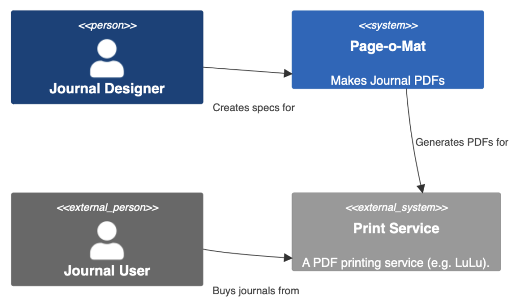
To give an example, here is some code that I used to add a context diagram to the Page-o-Mat README (here’s a link to the commit in case I change it later).

C4Context
  %% This is a Mermaid diagram for the system context
  Person(designer, "Journal Designer")
  System(pageomat, "Page-o-Mat", "Makes Journal PDFs")

  Person_Ext(journaler, "Journal User")
  System_Ext(printservice, "Print Service", "A PDF printing service (e.g. LuLu).")
  
  Rel(designer, pageomat, "Creates specs for")
  Rel(pageomat, printservice, "Generates PDFs for")
  Rel(journaler, printservice, "Buys journals from")

  UpdateLayoutConfig($c4ShapeInRow="2", $c4BoundaryInRow="1")
  UpdateRelStyle(designer, pageomat, $offsetX="-40", $offsetY="40")
  UpdateRelStyle(journaler, printservice, $offsetX="-40", $offsetY="40")

It looks like this:

Page-o-Mat C4 context diagram

You can see that color is being used to indicate which parts of the entire system are in scope for the project.

If that’s too frustrating to use, then I suggest MonoDraw for making an ASCII Art version. The downside is that this diagram is hard to edit, but a context diagram doesn’t change much. Another small issue is that you can’t use color. I can live with just text tags (in <<>>) for that because it saves me having to add more files to the repo for diagrams.

For Diagramming, Favor in-Document Editing

I made my UML Cheatsheet using OmniGraffle. I also used it for all of the diagrams in my book, Hello! iOS Development. It is an excellent diagramming tool that I recommend wholeheartedly, but I find that I can’t use it for my software project documentation.

All of my projects are documented in either Confluence, markdown files, or as source comments. The only way to use diagrams I make with OmniGraffle is to attach them somehow, usually as an exported PDF or image. When I read the document, this is fine, because the diagram will be shown inline.

But it’s missing two very important features

  1. I can’t make the diagram interactive. The main thing I want is for the various boxes to be links to the text documentation or other diagrams.
  2. I can’t edit the diagrams. I’d need to go back to OmniGraffle, find the source document, edit it, and then re-export it and get it to the document editor.

That second point is a deal-breaker for me to the point that I am dealing with diagramming software that is a lot worse than OmniGraffle just because I can edit the diagrams inline.

For Confluence, I am using the draw.io add-on [UPDATE: in Sep 2023 I moved to PlantUML]. Its main drawback is that it’s web-based, but of course, that’s the only way in-doc editing could work in Confluence. OmniGraffle is amazing because it’s a native desktop app written by one of the premier (if not THE premier) native macOS application development shops. I respect what the draw.io team has done in a browser, but it’s frustrating to use compared to OmniGraffle.

For Markdown, I started with MonoDraw, which is a native diagramming app that produces Ascii Art diagrams (good for embedding in source and Markdown), but again, not editable in the document. Once I saw that GitHub supported mermaid directly, I started to move over to it, even though it’s very limited. But I can make the diagrams I need (or close enough).

But, in-doc editing trumps everything for me. Without it, editing the diagrams has too much friction, and I risk them becoming out-of-date.