Category Archives: Software Development

Sprint-o-Mat 2021.1 is Available

i just released Sprint-o-Mat 2021.1 to the App Store.

Sprint-o-Mat is a watch-only app that lets you define, and then run, programmed running workouts. If you are using a training program for your running, you might be familiar with workouts like:

  1. Run 15 minutes to warm-up at a slow pace
  2. Then, Repeat 6 times
    1. Run 1/2 mile at your 5k pace
    2. Run 1/4 at a rest pace
  3. Cool down with a 10 minute run at a slow pace

Sprint-o-Mat comes with templates that you can use to define those runs. You can set individual paces and heart-rate zones for each leg.

Then, when you are running, you get a visual display of where you are in the workout and haptics and dings when it’s time to switch to the next segment.

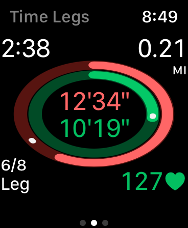
For example, yesterday I needed to run 8 miles at around 10:45 for a marathon training program I am doing. I broke it into a repeat of 8 1-mile runs. At mile 6, I took this screenshot

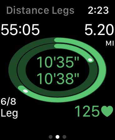
The outer ring is the entire 8-mile run, and the inner ring is the current mile. The white dots are pace runners. I can see at a glance that I am basically on pace.

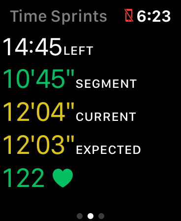
The corners have more info. The top has total elapsed time and distance. The bottom has the segment name and my heart-rate.

Everything is green because I’m in the zones I set up.

At the end of the run, Sprint-o-Mat will save all the info to HealthKit so you can see it in Health or Activity on your phone. I recommend the RunGap app if you want to do more with the data (e.g. send it to Strava). I have worked with the developer to make sure Sprint-o-Mat saves the data in a format it can use.

In Icon-Last Development, I wrote about the evolution from the first version to this one and how it affected the icon. I have a few more articles coming later in January.

Sprint-o-Mat supports Apple Watch Series 3 to current, including all sizes from 38mm to 44mm, and it’s free. Take a look.

Use GitHub Profile Pages to Mirror Your Personal Site

In 2014, I wrote that a direct GitHub link to your profile was not good enough for a resume. At that time, the profile page was not customizable enough and was confusing for a recruiter or hiring manager to use to understand your portfolio.

My suggestion was to link to your-site.com/github instead (for example: loufranco.com/github). I recommended that you organize your open-source work more like a portfolio and highlight the most important work.

But, since 2014, GitHub has made updates to profile pages. Right now, I would say that they are finally good enough to use directly if you want. It’s just a README and you have total control of the text.

But, I decided to just mirror my personal page on it. The one big advantage of my personal page is that I have access to the analytics for it. I am not in the job market, but if I were, I could also put a contact form on it. My own page is also more customizable than a README.

GitHub profile pages will probably rank higher in search and are linked up directly in GitHub. So having something there is also important, which is why I mirrored my personal page.

My 2014 article had some advice on what should be on your profile page. I’ll be revisiting that soon.

Icon-Last Development

I am about to release an update to Sprint-o-Mat. I decided to change the text-based UI to something more visual.

The point of Sprint-o-Mat is to guide you during programmed workouts. In my training, I do workouts like this:

  1. Warm up for 15 minutes at a slow place
  2. Repeat 4 times
    1. Sprint 1/2 mile at my 5k pace
    2. Rest 1/2 mile at a slow pace
  3. Cool down for 10 minutes at a slow pace

Sprint-o-Mat lets you define these runs and then guides you during them with haptics and a read-out. The current version’s running UI looks like this:

I had a few problems with this. First, this is hard to read while running. Second, it doesn’t emphasize the most important information. Finally, there were actually two screens like this that you toggled between with a tap (the UI was not opinionated enough).

So, I changed it to this (just a single screen):

In this view, the outer oval tells you about your overall pace (the white dot is a pace setter) and the inner oval tells you about this particular segment. The center shows those two paces (overall and segment). If you want more info, the corners have details.

Based on this new UI, I changed my icon from:

To:

Once you use the app, this icon is a much better visual cue to it. It also evokes a track, which is a good symbol for sprinting. The original icon evoked sprinting more directly, but it has very little to do with the app otherwise.

This progression from app design back to icon is the opposite of how I did it for Fast-o-Mat.

Vague Tutorials Would Help with Coding Interviews

I think tutorials should be vaguer because “A [vague tutorial] would get the reader playing instead of reading and help them practice composing code instead of copying it.”

In a typical tutorial, all of the code is inline with the text, which tries to explain it line-by-line. In a vague tutorial, you’d get just enough information to write the code yourself. Some code would be given as a scaffold with blanks you fill in.

This is very much like how coding interviews work, so doing a series of vague tutorials would be good training for them.

This means that the sites that are doing training for coding interview (e.g. TopCoder and HackerRank) are to some extent vague tutorial writers. It’s interesting that they also gamify their sites (mostly via ranking), which gets at the theme of many of my posts, although I think gamification is not as good as playability.

In my last job hunt, I knew my target employers gave very hard data-structure/algorithmic style coding interviews, so I spent weeks on TopCoder (most failing) before I applied. The main things I got out of it was deciphering specifications under time pressure and iterative development. Both of these skills are invaluable when doing a coding interview, because unfortunately, tech job interviews are mostly auditions.

AR Opens up Playability Possibilities

Yesterday, I pointed out that Pokémon Go was a playable workout app, where playable means that the game design ideas are driving the app, as opposed to gamification, where it’s slapped on.

I was thinking more about this and realized how many apps may be turned into games via AR. Again, not with badges, but by making playing the point of the app.

Not just for workout apps, which I think will drive lots of AR games.

But for something really different: consider an app that wanted to help you to eat healthier by guiding you while grocery shopping.

We all know what that app would look like: a list of grocery items, maybe color coded with “healthiness”. You tap tap tap when you buy eggplant, spinach, and blueberries (“You got an anti-oxidant badge!”). You lose points when you scan that box of mini-donuts.

The AR version has zombies in the cookie aisle.

Interestingly, the produce section seems to have no zombies—better scavenge there. Cookie boxes emit a piercing sound when they are in your cart, drawing the dead towards you. Leave them behind to draw them away.

An art appreciation app could help me get more out of a museum by telling me a little about what I might see and then making a ad-hoc quiz show as I take in the art. Or putting me in a pub quiz later based on what I looked at.

AR could turn a tour guide app into a spy hunt game. Follow that lady in the black trench coat and see what she’s up to—she’s boarding the boat to the Statue of Liberty! It’s practically the plot of North by Northwest.

These would be games, which are fun, not gamification.

Pokémon Go is Playable, Apple Workouts is Gamified

Let’s say you are trying to develop an app where the goal is to get the user to walk more outside.

Pokémon Go does this by building an AR world where it is fun to go outside and find pokémon, and then it makes you walk in order to hatch them. It makes you go to new destinations to progress in the game. Walking is a byproduct that is not particularly rewarded outside of the game goals you achieve. For example, you aren’t given a badge just for walking a lot.

In Apple Workouts, I walk if I want to. I can tell the app or not. It tries to encourage me with alerts and badges (and filling my rings). It’s using positive reinforcement and the elements of games, but walking is not a game. They have layered on points, levels, badges, and competition.

This is what I mean about the difference between playability and gamification. I don’t think that Pokémon Go was actually trying to make a workout app. The walking mechanic is just what is available to an AR game—it’s the equivalent to the walking/running you have to do in any side-scroller.

Like Pokémon Go, the playable version of a thing is unlikely to resemble that thing at all. The gamified version is recognizable for what it is.

Icon-first Development

I’m currently working on an app to help me with intermittent fasting. I developed it icon-first.

My apps mostly exist to drive my own learning. Right now, I am trying to learn SwiftUI and visual design.

To do the latter, I’ve been reading Designing Visual Interfaces, which came highly recommended from Amy Hoy. The first chapter teaches techniques for simplification, and so I decided to not think about the UI at all at first, but to find some kind of unifying metaphor by trying to design an icon that meant “intermittent fasting” to me.

In intermittent fasting, you try to eat in a defined time window each day, commonly eight hours (so, fasting sixteen hours). Many people just pick a time window and use it every day (e.g. 10-6), but that doesn’t work for me—I want to decide each day what woks best for my schedule.

So, with that vague idea, I started sketching

To get loose, I just drew a circle. Then, a pie chart that showed the feeding window as a third of the whole. Then, I tried a ring. Eventually, I just had a vertical stripe, then a horizontal one. I realized the essence was “thirds”—8 is a one-third of 24. I also had the idea that I could hide an “F” in the design (for Fast-o-Mat, the name of the app). I don’t like icons that have a word or letter in them, but a hidden letter in the design is fine with me.

At this point, I thought I could go into Pixelmator and refine. There have been many iterations. This one imagines showing seven days of history in a vertical stack.

I really like how the “F” is hidden in this one. The problem was that when I went to make this UI, I didn’t like using it. Seven days is way too cumbersome when you mostly just want to deal with today (and maybe yesterday and tomorrow).

Also, a phone is tall and narrow, so this design overemphasizes the week over the day when you render it in portrait. It’s hard to edit the today-bar, because it’s too narrow.

So, I worked on my UI and eventually settled on only showing three days (yesterday, today, and tomorrow). I went back to the icon and made this:

This does not have as recognizable an “F” in it, but that’s not the priority, so I am ok with that. Each vertical bar is a day and its position shows the part of the day you are feeding. The Today bar is bigger than the other days, because that’s the most important. On a phone, this whole things is stretched vertically, so there’s plenty of tap space on the parts of the bar you might need to interact with.

I am still working on refining the UI. I’ll follow-up when that is closer with thoughts on how that evolved.

Working through the icon helped me focus on simplicity. Designing Visual Interfaces talks about designs being instantly recognizable and impossible to use incorrectly. A lot of this comes from reducing the number of elements.

The second chapter is about visual perception, using things like contrast and size to allow the user to group elements into layers and order them.

Using the constraint of designing an icon first helped me focus on those aspects of design.

New Article in the Swift Companion: Methods

Yesterday, I wrote that books should get you to write code, not just read it. I’ve been working on a companion to Apple’s Swift Programming Language book that helps you do that by offering exercises for each chapter.

I just published the companion to the Methods chapter on App-o-Mat. If you want to start from the beginning, go to the outline of Section 1. If you understand the content of the corresponding chapter, the exercises are meant to be very easy. If you are having trouble with them, it would be a good idea to review the chapter again before moving on.

Learn Programming by Writing Programs

Most programming books and tutorials show you code and explain it. What they should be doing is describing code they want you to write.

Here are some examples:

  • Project Euler presents one numerical programming problem at a time. You must provide the correct answer (a number) before you can see the next one.
  • Apple’s Swift playground books on iPad also make you write code. Your programs move a robot around a board, and it knows if you achieved the goal they specified.
  • The Unwrap app by Paul Hudson. It combines video and written lessons with challenges of various types including writing Swift code. Each lesson is very small.
  • freeCodeCamp breaks down learning web development into tiny coding challenges that are auto-checked by the site.
  • Cryptopals teaches you how to write cryptography and code that attacks it with lessons you check against the expected output.

The big advantage of this style is each level can be very focussed on using just one new skill. In this talk by Kathy Sierra (and in her book Badass) she covers the research behind skill acquisition. One big idea is that you need to break skills down into tiny sub-skills. The reason is so you can master part of a skill, rather than half-master a full skill, which is hard to improve later.

She also says that learners need feedback, which these systems do by verifying your work automatically (or by having an expected output you can check).

In contrast, most programming tutorials are quite long and don’t make you create your own programs (so can’t really provide feedback).

If all you do is read or type in the code in the tutorial, you aren’t practicing a core skill of programming, which is to write code on your own to match a specification.

App-o-Mat updates

I started App-o-Mat as an iOS tutorial site back when I was consulting. It mostly had cordova screencasts.  I’m going to be doing more writing about iOS there (native and possibly cordova-based).

You can subscribe to the mailing list there if you want to get updates. If you have requests for topics to write about, let me know.

Here are the latest posts:

How do I pass values from a VC back to the VC that presented it?

Ok, so you have a view controller that brings up another view controller. Let’s call the first one FirstVC and the second one SecondVC. FirstVC either presents SecondVC or there is some segue that it uses to bring it up.

How do you keep Storyboards from causing merge problems later?

There’s this myth in the iOS community that “professional” iOS developers never use Interface Builder. It’s meant to imply that coding your interfaces is always better, and if you don’t do it, you are somehow less of a programmer. The myth perpetuates the idea that IB is a crutch, a toy, something that only newbies use.

I call BS.

How do you pass values to a VC in a segue?

A theme I see a lot on StackOverflow is a developer makes a View Controller that collects some information from a user and wants to use it on a VC that they bring up in a segue.