Author Archives: Lou Franco

How A Car Honk is Like a Green Light

A couple of days ago I wrote about sonifications, the sound equivalent to visualizations. Even though they haven’t permeated business culture in the same way visualizations have, they are around us used in a folk way—meaning, designers use sound in their interfaces, but it isn’t systematic or directly supported in tools.

Even without that discipline, sonifications generally do a much better job of making themselves actionable. This is because that’s the main reason you use sound. You need to interrupt the user and get them to do something now. In my last essay on this topic, I gave a list of examples you encounter while driving: car honks, sirens, lane-drift warnings, etc—they all need immediate attention.

If we look at visualizations we encounter while driving, actionability is a core-driver. The gas light, tire-pressure warning, traffic lights all translate to simple actions. Even the check engine light wants you take an action (which is true even if you ignore it).

A lot of visualizations I see elsewhere aren’t that clear. It’s easy to make charts in most software that has data, and the easiest thing to do is to pick a chart template and populate it. It practically makes itself.

The problem is that many visualizations are communicating the list of data and not the action. Instead of random lines going up and down periodically, I want a green or red light*. And just like in my hometown of Queens, if I don’t pay attention to the light, a honk.


* Augmented for color-blindness and accessibility, of course

March 2021 Blog Review

This month I released a podcast. I believe that a podcast can be a companion to another activity. I had thought that I could come up with something related to coding, but that was too hard to do without visuals.

So, I decided to try a writing program for programmers. Write While True is a podcast that helps programmers establish a writing habit. Each episode is around 10 minutes, and you are meant to do the writing exercise it describes as soon as the podcast is done.

If you are finding this post way after March 2021, and you are interested, I recommend listening to the first few episodes. They are foundational and meant to be evergreen. If you are a programer that writes publicly and has some tips, get in touch, because I’m going to have guests at some point.

I’m proud that my process makes my podcast accessible.

I’m thinking a lot about Excel. I have seen a lot of non-programmers make incredible things with it. I wrote Excel is Programming and Excel as a Programming Language with my nascent thoughts on that. I plan to write more about this.

I had a lot of random pieces related to software development:

Yesterday, I wrote about sonifications, which are the sound equivalent of visualizations. I’ll have a lot more to say about that in April.

What is the Sound Equivalent of a Visualization?

Visualizations are well-studied, understood, and popularized. They are a part of every day life—we see weather maps, activity circles, and stock charts every day.

We know the names of the patterns: bar chart, pie chart, line chart, etc. We learn them in grade school. You probably put one in your slide deck last week.

I’ve often wondered why this was not true of Sonifications. If you’re like me, this term will be new to you. It actually took me a while to find it—my google searches came up with Auralizations and Audibilizations first. But, if you’re talking about trying to understand data with sound, the correct term seems to be Sonification.

There is a body of research about it in academia, but it doesn’t extend much outside of there. As far as I can tell, there is no equivalent to Edward Tufte’s visualization books, but for sound. There is no way to make them in Excel.

But they are all around us. We hear, make, and use them all of the time.

Consider just the ones you might encounter while driving.

When you honk your horn, you are conveying information about your car and mood to others. Similarly, an ambulance uses a siren to convey their position and direction to you.

My car tells me (with beeps) if I am drifting out of my lane. It gets even madder if I am about to hit something. It beeps whenever I shift into reverse. Turning signals remind me to turn them off with a steady metronome-like beat. So do the hazard lights.

I get warnings when my lights are left on, the keys are locked in, or if I don’t fully shut the door.

If my radio is tuned to traffic, that’s a kind of Sonification (data -> speech). My GPS does the same kind of thing for directions.

Radar detectors buzz if they detect the fuzz.

So, I hope I have convinced you that Sonifications are common. In my own thinking I have come up with these few similarities that seem to tie them together

  • Sonifications are real-time
  • Sonifications are actionable
  • Sonifications interrupt you while you are engaged doing something else

This is why we use them in a car. You are completely busy, with your vision fully engaged in a life or death activity. The sonifications are there to tell you that something important needs to be done right now.

Giving Actionable Feedback on UI Design

I cringe when I hear a GUI described as “ugly”. It’s not that I don’t see it too, but the feedback isn’t helpful. I can’t set the ugliness lower.

If something looks “ugly” to you, use that to guide your attention and analysis. What we often perceive as ugly is rooted in rules of perception and communication.

To give you an idea, considering just the visual look of a design (not its interactions), try to judge

  • How easy is it to see the entire UI as various levels: as a whole, as a collection of a few parts, at a detail level.
  • How quickly can you scan and visually acquire a component.
  • How correct is your intuition on how a component would work based on what it looks like
  • How easy it is to tell things apart.
  • How easy is it to group things

Then, try to express you critique as: this “attribute of the design” doesn’t accomplish “this specific communication goal”

Here are some examples of what I mean:

  • The button icons aren’t easy to tell apart so they are hard to find right away.
  • The buttons need more padding because the text is too close to the border, making it harder to read.
  • I can’t tell the difference between the various header levels
  • The colors of the icons don’t feel like they come from a unified palette. Let’s try to match their saturation and brightness levels.
  • It isn’t clear if this visualization means that the state of the system is good or bad — it needs more context
  • There isn’t enough contrast between the most important parts and rest of the UI
  • There isn’t enough whitespace helping to form a hierarchy of information
  • The spacing between paragraphs isn’t proportionate to the font and line height. It makes it harder to read the text.

Look at the visual variables: colors, values (lightness/darkness), sizes, positions, and shapes. Consider whitespace. Look at the relationships between the components.

Consider if there is too much or too little contrast. Is there harmony between things that are supposed to be the same? Do the most important things draw the eye? Can you scan?

These are just the surface level. Bad UIs are usually bad at a level deeper than that. But if it looks “ugly”, expressing that as contrast/harmony of visual variables is more actionable.

Call for Write While True Podcast Guests

A couple of weeks ago, I launched Write While True, which is a writing program for programmers (in the sense of a training program). The core episodes will be short descriptions of writing exercises that will get you writing.

But, I do think it would be good to have guests.

In a guest segment, I do want to eventually get to some actionable advice, and I think it would help if the guest wrote regularly somewhere, since the core thesis is that the podcast will help you write more.

If you are a programmer, then it’s fine if that writing is on a blog, but if you are not a programmer, then I would prefer that you are a professional writer of some sort.

If this sounds like you, get in touch.

New App-o-Mat Article: Why You Should Use SwiftUI for Developing Apple Watch Apps

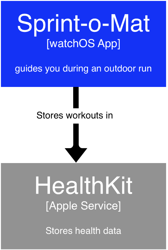
I am developing a series of articles based on my experience developing Sprint-o-Mat. The first one explains Why You Should Use SwiftUI for Developing Apple Watch Apps.

My Apple Watch app, Sprint-o-Mat, was originally an iPhone/Watch app combination because, at that time, a Watch app needed to be paired with an iPhone app.

Then, 3 months after I started, Apple changed everything about Apple Watch app development.

I’ll be covering Apple Watch app development in detail, with an emphasis on workout apps. Subscribe to get email notifications of new articles if you want to follow along.

Software that knows ROI

Businesses adopt software for some rational reason. That reason is often expressed as a return on investment (ROI).

Based on the home pages of most software vendors, sales and marketing definitely know this. But based on the actual software, product development doesn’t seem to. Good software delivers ROI, but most don’t bother to tell you afterwards.

Decision makers in the organization care about this metric and will try to predict it before adoption and will probably track it afterwards.

And even if they don’t—if they were to magically know this metric, it would inform their decisions about renewal and increasing adoption. Sales and marketing lead with this info because they know that it’s a compelling selling strategy. They use ROI language in case-studies and may even have an ROI calculator on their site.

What I don’t see as often is an ROI calculator right in the software itself.

This is a huge missed opportunity. Lots of software has the exact data on how well it has achieved an ROI for you. That number is also a proxy for the ROI of the user that operates it or the decision maker that purchased it, so they would be very likely to want to share it.

SaaS products have a bigger advantage of not only knowing the ROI, but also being able to compare across customers and derive insights to why some customers are getting more benefit than others.

This information can drive account management calls, webinar topics, training, etc. Not to mention that the software could try to drive the user to those behaviors.

The model here to look at is Google Adwords. ROI literally drives the entire product UX and is reported on a line-item basis. It is deeply integrated into how you think of the product and adword metrics, PPC and CPC, have become common vocabulary in the industry.

So, what about your software? What is driving its value? Is that information readily available in the product itself? Does it drive user behavior? If not, how could it? Contact me if you want to talk more about this.

How Senior Software Developers Think

Senior Developers are expected to be more skilled in the technical aspects of software development. Just by having more years of experience they should be able to solve more problems, have more techniques, be faster, etc.

But, this alone is not enough to make them “senior” in my view. They will be more valuable than a junior developer doing tasks, but you can’t scale a team with a group of expert task doers.

The biggest differentiator between a junior developer and a more senior one is in the scope of their thinking and planning.

To keep it simple, imagine four levels of engineer (Jr, Dev, Sr, Lead). Here are some of the differences aside from programming skill. This distinction has nothing to do with people management—none of these levels have management responsibilities.

  1. Jr: Right out of school. Cannot do any task without some help. Can plan a couple of days of work.
  2. Dev: Can do most tasks independently. Can plan projects that take weeks to do.
  3. Sr: Takes product specs and writes functional/implementation specs and plans. Can plan projects that take months to do. Can coordinate the work of a team.
  4. Lead: Can plan projects that may take years. Thinks about overall architecture. Establishes processes. Can coordinate the work of multiple teams.

There is more to it than this, but the essence is increasing scope of time, planning, and coordination.

Another way to think of it is in what their goals are:

  1. Jr: Complete the ticket: e.g. Fix the bug, deploy the build
  2. Dev: Complete the project: e.g. Implement the export to CSV feature as specified
  3. Sr: Achieve the mission of the project/team: e.g. Increase paid conversion, reduce the crash rate
  4. Lead: Achieve the mission of the company: e.g. Increase profit margin by 10%, enter an adjacent market

To be fair, everyone should be working on the mission of the company. The difference is how they think about the work they are doing and how they evaluate success.