I am about to release an update to Sprint-o-Mat. I decided to change the text-based UI to something more visual.
The point of Sprint-o-Mat is to guide you during programmed workouts. In my training, I do workouts like this:
- Warm up for 15 minutes at a slow place
- Repeat 4 times
- Sprint 1/2 mile at my 5k pace
- Rest 1/2 mile at a slow pace
- Cool down for 10 minutes at a slow pace
Sprint-o-Mat lets you define these runs and then guides you during them with haptics and a read-out. The current version’s running UI looks like this:
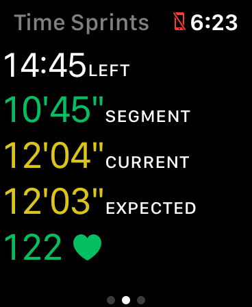
I had a few problems with this. First, this is hard to read while running. Second, it doesn’t emphasize the most important information. Finally, there were actually two screens like this that you toggled between with a tap (the UI was not opinionated enough).
So, I changed it to this (just a single screen):
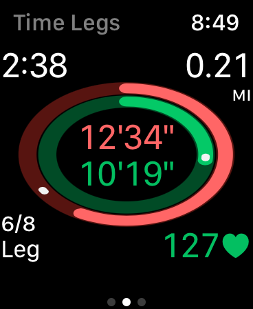
In this view, the outer oval tells you about your overall pace (the white dot is a pace setter) and the inner oval tells you about this particular segment. The center shows those two paces (overall and segment). If you want more info, the corners have details.
Based on this new UI, I changed my icon from:
To:

Once you use the app, this icon is a much better visual cue to it. It also evokes a track, which is a good symbol for sprinting. The original icon evoked sprinting more directly, but it has very little to do with the app otherwise.
This progression from app design back to icon is the opposite of how I did it for Fast-o-Mat.