Yesterday, I posted a spreadsheet to help you explore how savings rate relates to eventual net worth in retirement.
It’s a very simple spreadsheet with a simple model, so I wanted to document it here in case you want to play the formulas.
Here is a description of the inputs and how they are used.
Age/A2: Your age. You can set this to your current age, or a past age if you want to figure out a benchmark
Year/B2: The year associated with the age in A2.
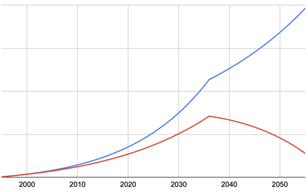
The sheet allows you to compare two scenarios. I1:I8 corresponds to Scenario A (the blue line) and K1:K8 corresponds to Scenario B (the red line)
Starting Net Worth/I2/K2: Your net worth at the age in A2
Market Return/I3/K3: The market return that will be applied to your net worth at the end of each year to determine the starting point for the next year. Obviously, this is simplistic. I recommend keeping this conservative—Use the nominal return (not the return after inflation).
Starting Salary/I4/K4: The gross salary (or income) at your age in A2
Inflation/I5/K5: The rate of inflation to use on expenses after retirement.
Raises/I6/K6: The expected % raise to your salary you will get each year. I set this a little over inflation. It is expected that your expenses and savings increase proportionally such that your saving rate stays constant.
Retirement Age/I7/K7: The age you plan to retire. At this point, you start to draw down against savings. Inflation is applied to the expenses every year. The starting expense amount is estimated based on your savings rate.
Savings Rate/I8/K8: The % of your gross income that you save.
Things this spreadsheet does not try to model:
- Big expenses like houses and college tuition
- Increasing expenses because of children
- Volatile markets
- Windfalls