Author Archives: Lou Franco

When 99.8% Success Wasn’t Very Good

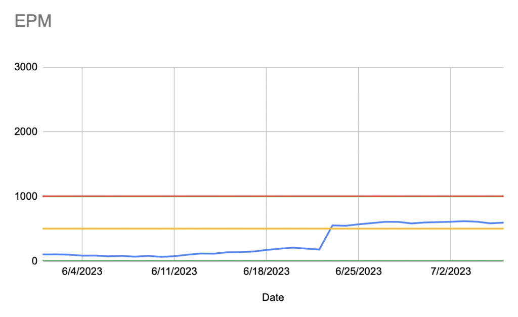
One of my projects at Trello was looking into and fixing a reliability problem we were having. Even though it seemed solid in testing, we were getting enough support tickets to know that it must be worse than we thought. We collected data on its success rate and found out that it was successful 99.8% of the time. To move forward with doing more work on it, I had to convince our team and management that 99.8% was bad.

At the time, there was a company-wide push at Atlassian to improve reliability, and there was a line-manager assigned to oversee it across Trello teams, so I spoke to him. I showed him the data, but also told him that there’s an overall feeling on our team that it’s affecting our customers more than it seems.

He suggested that I flip the ratio and instead look at the data as Errors Per Million. When you do that, with the same data, you get 2,000 errors per million attempts. This particular thing happened around 2 million times per day, so that was 4,000 errors per day. That partially explained the issue, because it wouldn’t take much for the support tickets to get out of control. Luckily, not all 4,000 were of the same severity, and many were being retried. Still, that number is too high.

The other thing I found after more analysis, was that the errors were not evenly spread across the user base. They tended to cluster among a smaller cohort, which was experiencing a much worse EPM than then rest of the users.

With that in hand, we greenlit a project to address this by targeting the most severe problems. We found several bugs. Eventually we got the success rate to 99.95%.

It’s not clear that 99.95% is four times better than 99.8%, but the equivalent EPM after the fixes is 500 (as opposed to 2,000 before). What surprised me is how different a reaction a high EPM got compared to equivalent numbers. 2,000 EPM is literally the same as 99.8% success and 0.2% failure rates, but the latter two seem fine. Even if I say we get 2 million attempts per day, it’s hard to intuitively understand what that means.

When I said 2,000 EPM, we instinctively felt that we failed 2,000 users. When I said we get 2 million attempts, everyone knows to double EPM to get 4,000 incidents per day, and we felt even worse. That simple change in reporting made all the difference in our perspective.

June 2023 Blog Roundup

WWDC was in the beginning of June, so did my usual posts about it

But, the Vision Pro was interesting enough to write about a few more times

I kept up with my Podcast and released every Sunday in June

In episode 23, I talked about how I pre-recorded five podcasts so I could take a break. So, at least I know that the next four will be on schedule in July.

I generally want to write about diagramming more. I am including visualizations in that general theme as well.

Finally, I generally write tips for working as a software engineer. Here are a few more

How I Use JIRA and Trello Together

I started using JIRA for issue tracking when I worked at Trello (at Atlassian), and I still use it now. JIRA does everything I need in managing software projects, but I never send people outside of my team to JIRA because it’s not easy for casual users. For that I use Trello.

I have a Trello board for each project I am managing that is meant to be a high-level summary of that project. It is useful for onboarding and getting its current status easily. It has links to JIRA, Confluence (for specifications), Atlas (for status) and Figma.

This Trello board is the first place I send a new team member to help with onboarding. If someone has a question in Slack about the project, I make sure that it was something you could find out on the board and then link them to it there. The board is a kind of dashboard and central hub of the project.

These hub boards are curated, so I don’t try to use any automations to bring things over. If I think you need more information, I send you directly to the source.

JIRA is useful to the people that work on the project every day. I use Trello for those that just check in weekly or monthly.

Visualizations Should Generate Actions

Yesterday, I shared a heatmap visualization that I used to target manual testing time. I chose a heatmap to show this data because you can tell what you need to do just by looking at it.

In this example

A heat map the test status of iOS devices across different features in an app

It’s pretty clear that you should get an iPhone 13 with iOS 15 on it and start testing everything. You could also explore board creation on all devices. If the entire heatmap were green, you would know that you had probably covered most areas.

It would be easy to write a program that took this same data and generated a to-do list instead. Maybe that would be preferable, but people like visual dashboards, and it’s easier to see the why behind the task if you have a sense of the underlying data.

But, that’s a big clue to whether your dashboard visualization works. If you could easily generate a to-do list just by looking at it, then it probably works. If you look at your dashboard and have no response, it might look pretty, but it’s not doing its job.

Use Heatmaps for iOS Beta Test Coverage

At Trello, I built a simple visualization for understanding coverage of our app during Beta periods. We used Mode to analyze data, and so I used their Heatmap.

Here’s a recreation in Google Sheets:

Along the top was each device family and OS. Individual devices were grouped based on how likely they were to be similar in testing (based on size, version, etc). I used this list of Apple device codes (which were logged with analytic data).

Along the left side were the most important screens and features. It was a much longer list that was generated from analytic categories.

The center of the visualization was a heat map based on how much usage that feature got on that device (at the cross-section) normalized against how much usage it got in production. So, if a cell was green, it meant that it was tested a lot when compared to how much it was used in production. If a cell was red, it meant it was under tested.

Often, entire vertical columns would be near red because the combination of device/OS wasn’t used much by our beta testers. So, we could direct our own efforts towards those devices and turn an entire column from red to green.

We also made sure new features would get their own row. These could also be red because beta testers might not know about them. We could similarly target those areas on all devices. These features could not be normalized against production usage (since they were not in production yet), so we use a baseline usage as a default.

Mode kept snapshots of the heatmaps over time. We could watch it go from nearly all red at the beginning of the beta period to more green by the end. I can’t say we could get the entire heatmap to be green, but we could at least make sure we were testing efficiently.

The Vision Pro’s R1 Chip is Real-time, not “Fast”

Almost all coverage of the R1 in the press is just a reprint of Apple’s PR, so it just says that the

[…] R1 chip processes input from 12 cameras, five sensors, and six microphones to ensure that content feels like it is appearing right in front of the user’s eyes, in real time. R1 streams new images to the displays within 12 milliseconds

Or some simple variation on that. Obviously, 12 milliseconds is “fast”, but that’s not the point of the R1.

If “fast” was all that was required, Apple probably could have gotten a process on the M2 to average 12 millisecond display times, maybe plus or minus a few milliseconds. The point of the R1 is that it guarantees to do that processing in an exact amount of time. That’s what “real-time” in real time chips and operating systems means. It lets you express your requirements to run tasks in a given amount of real time and can guarantee it before runtime.

This is not the first time Apple tried to get “real-time” working for a single element of a device. In the original iPhone, scrolling with your finger was given such high priority that displaying the view was partially delayed. John Gruber described it well in his review from 2007:

Update: Real-time dragging is such a priority that if the iPhone can’t keep up and render what you’re dragging in real-time, it won’t even try, and you get a checkerboard pattern reminiscent of a transparent Photoshop layer until it catches up (typically, an instant later). I.e. iPhone prioritizes drag animation over the rendering of the contents; feel over appearance.

This was the compromise they had to make in 2007, but in 2023, with the same requirement to prioritize “feel”, they decided to keep appearance this time and trade-off price, complexity, and battery-life.

Write While True Episode 23: Take a Break

We just passed the second anniversary of the break that I didn’t come back from right away.

I know exactly what was going on. I had a lot of travel to visit family and for work and it was just hard to find the time to plan and record podcasts.

Well, since it’s exactly two years later. It’s summer again, and I want to take another break. But this time I have a plan to take a break, but still publish on schedule and hopefully, not lose my momentum.

Transcript

PR Authors Have a lot of Control on PR Idle Time

Getting a pull request reviewed quickly is often under the author’s control. This is great news because, according to DevEx, you should reduce feedback loops to increase developer productivity. There are other feedback loops that a developer experiences, but pull requests happen all of the time. You can have a big impact on productivity if they happen faster, and a big reason they don’t is because of the commits in the PR.

At Trello, during a hackathon, someone did an analysis on all of the PRs on all of the teams to see if they could get some insights. At the time, we probably had about 10 teams of about 7-10 developers each.

One thing they looked at was median time to approve a PR based on team, and there were two teams that were far outliers (with smaller waits for a PR to be approved). They went further to look at the PRs themselves and noticed that they generally had fewer commits and the commits themselves were smaller. The number of pull requests per developer-week was much higher than other teams.

I was on one of those teams, and the other one was very closely aligned with us (meaning we had a lot of shared processes and rituals). When we very small, 5 total developers, we were basically one team with a shared lead. The style of PR on these teams was very intentional. When I was onboarded, I was given very specific instructions on how to make a PR.

The essence of what we did was to completely rewrite the commits before making a pull-request to “tell a story”. I wrote about the details in Construct PRs to Make Reviewing Easy.

As a reviewer, this made it very easy to do approvals, which we could fit it in at almost any time. With all of us doing this, many PRs were approved within an hour and most in a few hours. A really good time to do some reviewing was right after submitting a PR, which made the throughput reach a steady-state. The PR list was rarely very long.

I worked in this style for the 6+ years I was on this team and know that it contributed to a high level of personal work satisfaction. Even though I had to wait for others to approve my work, I felt that my own productivity was largely under my control.

Related: Metrics that Resist Gaming

The Tools and Materials of Writing

I sketch—mostly with pencil and charcoal on paper. To do that, I have had to become proficient with the physical nature of the drawing tools and the paper. Over time, I have become better at manipulating them because I do a lot of drawing.

When I was learning programming, I Didn’t Have a Disk Drive, so every day I started by typing in my program from the day before and then I added to it. In that time, I became proficient with the tools of programming—the typing, the code editing.

I was trying to think of what the equivalent was for writing. Typing is certainly part of modern writing. I think it’s good that I’m a fast and accurate typist. But, text editing is very easy compared to code editing.

After thinking about it for a bit, I think a basic part of writing is sentence construction. Sentences are the things you build paragraphs from. And you use paragraphs to build bigger works. Sentences are like marks on a sketch—a basic building block.

If manipulating a piece of charcoal on paper in different ways is the way to practice making marks. What is the thing I could do to practice making sentences?

I have a clue from David Lambuth’s Golden Book on Writing [amazon affiliate link]:

Complex sentences alone make possible that careful indication of the importance of one idea over another and that sense of the interrelation of ideas which is essential to accurate thinking.

Not until you have learned to select almost unconsciously the central, dominating thought of your sentence, and to group around this in varying degrees of emphasis the secondary or modifying thoughts, have you learned to think clearly.

The tool you are learning to manipulate is clauses. Simple sentences are simple. A complex sentence, however, is made up of clauses that are used give nuance to a complex thought, which you express by ordering them.

Just Started a New Software Engineering Job? Fix Onboarding

If you are about to start a new job as a software engineer, the way to have a big impact day one is to go through the onboarding with the intention to generate a list of improvements that you work on over time.

Here are some things to look for

  1. Incorrect or outdated information. If you find these, just fix them as you find them.
  2. Missing entry-point documentation. Even teams that have good documentation often do not have a document that is useful if you know nothing. Often they don’t go back and make a good “start here” kind of document.
  3. Manual steps that could be scripted. Don’t go overboard, but if you see some quick wins to automate the dev setup steps, it’s a good first PR. It’s a tech debt payoff that is timed perfectly.
  4. Dev Setup Automation bug fixes. If anything goes wrong while running the scripts to set up your machine, fix the bug or try to add in any detection (or better error messages) that would have helped diagnose the issue.

There is usually a lot of tech-debt in onboarding code and documents because no one really goes through them. Sometimes underlying things just change and tech debt happens to you. You are in a unique position to make it better for the next person and have some impact right away.