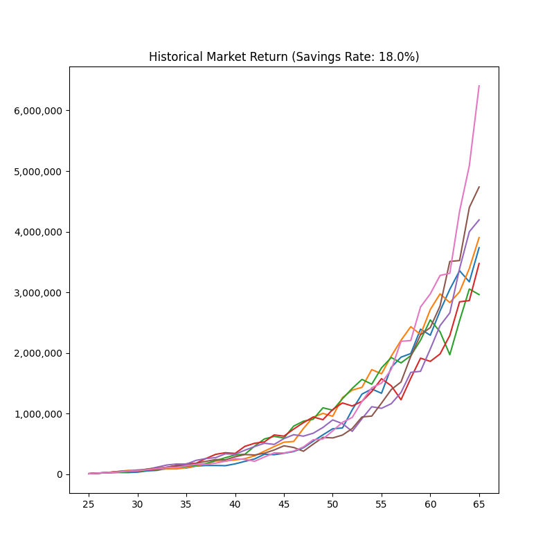
Category Archives: Software Development

Deliberate Practice for Knowledge Workers

You have probably heard that 10,000 hours of practice leads to expertise, a notion popularized by Malcolm Gladwell. The details are more complex than this and are spelled out by the researcher behind this statement, Anders Ericsson, in Peak [amazon affiliate link]. If you want a good breakdown of it, Badass [amazon affiliate link] by Kathy Sierra is much a better distillation and practical guide to practice than Gladwell. (I gave a talk about Badass for iOS developers a few years ago—there’s a synopsis of the book there)

The main thing to know is that the nature of the practice matters. Ericsson calls it deliberate practice. I think if you’ve taken music lessons, you have probably been exposed to deliberate practice.

Skills are broken down and practiced individually until they become automatic and expert-level in isolation. Bigger skills are built up from automatic ones and you constantly repractice those skills to keep them automatic.

In athletics, deliberate practice is also the norm.

But, what about knowledge work? It’s certainly not the norm to talk about deliberate practice in knowledge work. You don’t see systematic practice very often.

One reason why is that a key element of deliberate practice is instantaneous feedback. If I throw a pitch, I can get the speed right away. I know how it felt. I know where it ended up in the strike zone. Modern technology can give me all kinds of data on it. When I play a guitar chord, I instantly know if I did it right (or at least, my teacher does).

That’s not easy to do for knowledge work.

I do think that, in programming, there’s a big opportunity to introduce a regimen of deliberate practice. There are tons of tutorials on individual tech blogs and Dev that show a market for them. We just need to remember what we need to train.

If you type in code that you read from a blog, you are practicing transcribing, not programming. Since programming is about disambiguation, that’s the skill to practice. Take a vague description of some goal and figure out how to program it. in my Swift Book Companion, that’s all I offer. There is no code to copy—only vague descriptions of code to write.

In Cal Newport’s Deep Thoughts podcast (see Ep. 32), practice is a common topic. He offers these two practice exercises for knowledge workers in general.

  1. Practice working uninterrupted on hard problems for at least 30 minutes and build that up to 1-2 hours. The practice is on not getting distracted and not stopping, not the actual work. You can easily get feedback on that part.
  2. Practice reading hard material uninterrupted. Again, the practice is on the focus.

A similar thing I do everyday for practice is morning pages. I talked about this in the first episode of my podcast. I am practicing “writing on demand”.

The two things to remember if you are designing practice for yourself.

  1. Break it down so that you are practicing one thing and trying to make it automatic
  2. Set it up so that you have instant feedback on whether you are doing it right

Once it’s automatic, it can be part of the next thing you practice.

Mitigating the Mitigations

The first step to dealing with project risk is to list mitigations—the steps you will take to avoid or handle the risk. But, don’t stop at just listing them.

The very next step should be to think about whether those mitigations themselves have obstacles.

For example, let’s say you have a project with a large mechanical portion, which doesn’t require communication or coordination to implement. If this work can be done in parallel, then adding engineers mid-way (once the a core has been established) could speed up the project, but even at the start, you must

  • Get budget approval
  • Find a source of engineers (contractors/internal)
  • Structure the work so that at some point it can be done without coordination and in parallel.

Projects like converting a lot of code from Objective-C to Swift or from an unsupported version of a framework to the current one work well for this. Projects that require a lot of cross-developer coordination are famously made later by adding engineers.

Depending on the stakes, it might be right to ask engineers to temporarily put in more hours, or to schedule time-off earlier in the project if possible. These things are easier to do if you talk about them earlier and gauge the impact.

A third option would be to clear off all other work so that everyone can concentrate on the high-priority work at hand. In that case, those projects have risks that need to be communicated to the project managers so that they can list and mitigate them.

It would be frustrating for a project risk to manifest itself, to have identified that early, and to have come up with an effective mitigation, which is not possible to do because it needed prior planning.

Assume the Failure

When planning a project, one thing I do is to imagine failure and work backwards. I am trying to figure out a theoretical root cause that I can mitigate. That’s a common project management technique.

But, if the seeming root cause is external, I keep going.

Instead of: The project slipped because …

Team X didn’t deliver part Y by MM-DD

which is hard to control, I assume responsibility for the failure:

We didn’t start the code using part Y until MM-DD

Then, these follow:

  • We didn’t build a mock of part Y so we could start our work before it was delivered
  • We didn’t ask for part Y to be put in staging before it was finished
  • We didn’t publish a full timeline showing the dependency on part Y to team X

And so on. These are all things I can do something about.

It’s Bad, Now What?

Creators of visualizations can learn a lot from sonifications, especially the focus on action. When your alarm goes off, you know to get up (or at least snooze). When I look at a lot of application dashboards, I often don’t know what to do. It looks bad, so now what?

One way we solved it at my old job was to pre-define levels on visualizations meant to show system health. We started with numbered levels, but then for simplicity we settled on green, yellow, and red. When you are driving, you know exactly what to do when the light is green or red. Even yellow only has a few options.

To help us think about these levels more, we labeled them Excellent, Acceptable, and Unacceptable.

Like red and green traffic lights, it’s clear what to do when your levels are Excellent or Unacceptable. Yellow/Acceptable levels are harder, but since our company mantra was “Don’t do Nothing” (in the face of a problem) and our goal was Excellence, we had to do something.

For us this meant (something like):

  • Yellow: Investigate and put a ticket on the backlog with enough priority to get addressed soon. It will be released as appropriate (no rush).
  • Red: Make a ticket and assign it now. It might be released immediately.

In practice, other things mattered.

  • How red or how yellow?
  • Is this a blip or sustained issue?
  • Is this caused by us or related to the environment (e.g. is US-East down?)
  • Will it go away on its own?

But even under these ambiguities, the first few steps were pretty clear, and the options for what to do next were small. And since the status got posted to our slack every morning (and reported to grand-bosses every month), we were very unlikely to let it drop.

How A Car Honk is Like a Green Light

A couple of days ago I wrote about sonifications, the sound equivalent to visualizations. Even though they haven’t permeated business culture in the same way visualizations have, they are around us used in a folk way—meaning, designers use sound in their interfaces, but it isn’t systematic or directly supported in tools.

Even without that discipline, sonifications generally do a much better job of making themselves actionable. This is because that’s the main reason you use sound. You need to interrupt the user and get them to do something now. In my last essay on this topic, I gave a list of examples you encounter while driving: car honks, sirens, lane-drift warnings, etc—they all need immediate attention.

If we look at visualizations we encounter while driving, actionability is a core-driver. The gas light, tire-pressure warning, traffic lights all translate to simple actions. Even the check engine light wants you take an action (which is true even if you ignore it).

A lot of visualizations I see elsewhere aren’t that clear. It’s easy to make charts in most software that has data, and the easiest thing to do is to pick a chart template and populate it. It practically makes itself.

The problem is that many visualizations are communicating the list of data and not the action. Instead of random lines going up and down periodically, I want a green or red light*. And just like in my hometown of Queens, if I don’t pay attention to the light, a honk.


* Augmented for color-blindness and accessibility, of course

Giving Actionable Feedback on UI Design

I cringe when I hear a GUI described as “ugly”. It’s not that I don’t see it too, but the feedback isn’t helpful. I can’t set the ugliness lower.

If something looks “ugly” to you, use that to guide your attention and analysis. What we often perceive as ugly is rooted in rules of perception and communication.

To give you an idea, considering just the visual look of a design (not its interactions), try to judge

  • How easy is it to see the entire UI as various levels: as a whole, as a collection of a few parts, at a detail level.
  • How quickly can you scan and visually acquire a component.
  • How correct is your intuition on how a component would work based on what it looks like
  • How easy it is to tell things apart.
  • How easy is it to group things

Then, try to express you critique as: this “attribute of the design” doesn’t accomplish “this specific communication goal”

Here are some examples of what I mean:

  • The button icons aren’t easy to tell apart so they are hard to find right away.
  • The buttons need more padding because the text is too close to the border, making it harder to read.
  • I can’t tell the difference between the various header levels
  • The colors of the icons don’t feel like they come from a unified palette. Let’s try to match their saturation and brightness levels.
  • It isn’t clear if this visualization means that the state of the system is good or bad — it needs more context
  • There isn’t enough contrast between the most important parts and rest of the UI
  • There isn’t enough whitespace helping to form a hierarchy of information
  • The spacing between paragraphs isn’t proportionate to the font and line height. It makes it harder to read the text.

Look at the visual variables: colors, values (lightness/darkness), sizes, positions, and shapes. Consider whitespace. Look at the relationships between the components.

Consider if there is too much or too little contrast. Is there harmony between things that are supposed to be the same? Do the most important things draw the eye? Can you scan?

These are just the surface level. Bad UIs are usually bad at a level deeper than that. But if it looks “ugly”, expressing that as contrast/harmony of visual variables is more actionable.

New App-o-Mat Article: Why You Should Use SwiftUI for Developing Apple Watch Apps

I am developing a series of articles based on my experience developing Sprint-o-Mat. The first one explains Why You Should Use SwiftUI for Developing Apple Watch Apps.

My Apple Watch app, Sprint-o-Mat, was originally an iPhone/Watch app combination because, at that time, a Watch app needed to be paired with an iPhone app.

Then, 3 months after I started, Apple changed everything about Apple Watch app development.

I’ll be covering Apple Watch app development in detail, with an emphasis on workout apps. Subscribe to get email notifications of new articles if you want to follow along.

How Senior Software Developers Think

Senior Developers are expected to be more skilled in the technical aspects of software development. Just by having more years of experience they should be able to solve more problems, have more techniques, be faster, etc.

But, this alone is not enough to make them “senior” in my view. They will be more valuable than a junior developer doing tasks, but you can’t scale a team with a group of expert task doers.

The biggest differentiator between a junior developer and a more senior one is in the scope of their thinking and planning.

To keep it simple, imagine four levels of engineer (Jr, Dev, Sr, Lead). Here are some of the differences aside from programming skill. This distinction has nothing to do with people management—none of these levels have management responsibilities.

  1. Jr: Right out of school. Cannot do any task without some help. Can plan a couple of days of work.
  2. Dev: Can do most tasks independently. Can plan projects that take weeks to do.
  3. Sr: Takes product specs and writes functional/implementation specs and plans. Can plan projects that take months to do. Can coordinate the work of a team.
  4. Lead: Can plan projects that may take years. Thinks about overall architecture. Establishes processes. Can coordinate the work of multiple teams.

There is more to it than this, but the essence is increasing scope of time, planning, and coordination.

Another way to think of it is in what their goals are:

  1. Jr: Complete the ticket: e.g. Fix the bug, deploy the build
  2. Dev: Complete the project: e.g. Implement the export to CSV feature as specified
  3. Sr: Achieve the mission of the project/team: e.g. Increase paid conversion, reduce the crash rate
  4. Lead: Achieve the mission of the company: e.g. Increase profit margin by 10%, enter an adjacent market

To be fair, everyone should be working on the mission of the company. The difference is how they think about the work they are doing and how they evaluate success.