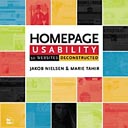
Jakob Nielsen has been supporting his book, Homepage Usability: 50 Websites Deconstructed, with a few of articles on homepage design. I took the opportunity to make some changes to my own site after reading them.
The first article, Top Ten Web Design Mistakes of 2003, lists what’s been annoying him recently. I did well on this one—I only needed to add some ALT text to my images (Tip #5 is Overly detailed ALT Text—oops, I actually didn’t have any) and make pages stop linking to themselves (#10). The latter improvement is not directly supported in my CMS tool (CityDesk) and took a fair amount of scripting, but armed with CityDesk keywords and my keyword organizing utility, I got it done.
That article linked to The Ten Most Violated Homepage Design Guidelines. I didn’t do too badly on that one either, but I decided to differently color visited links and make it more clear where you are on the site (#3). I rewrote my tag line to be more informative (#5) and made my tags more descriptive. I was already following #2 (Use a liquid layout that lets users adjust the homepage size), since that’s a pet-peeve of mine.
Finally, I read Top Ten Guidelines for Homepage Usability. By this point, most of the tips were redundant. I haven’t added a search yet, but I’ll do that soon.
The book has over a hundred guidelines sure to improve any site.
