Category Archives: Software Development

Who is Responsible for Usability?

It’s great that unit testing is getting a lot of attention. There are xUnit frameworks for every language, and secondary tools are emerging. It is also becoming common to designate some developers as “in test”, meaning that they develop software to test their organization’s development projects. More importantly though, developers are thinking about testing, educating themselves, and taking responsibility. A similar movement needs to take place in software usability.

A usability department is more rare than a QA department ever was. Most developers will never work with a usability expert, and even if they did, they still would have a lot of usability decisions to make. Like other aspects of software creation, developers need to learn the concepts of usability. But, unlike many aspects of development, usability is not clearly quantifiable or automatable. There are some rigorous methods, but usability knowledge is essentially a set of heuristics and the ability to imagine yourself as the user.

The heuristics can be learned either by example or counter-example.  But imagining yourself as the user is a little harder.

You spend all day with the software you create. It is probably one of the most important things in your life—it pays for your food and rent. You know everything about it.

Your users prefer not to even think about your software. They have tasks they are trying to accomplish (to earn money to buy food and pay the rent). Even vitally important software, like my web browser, my e-mail client or my compiler, are insignificant when compared to my family, my job, paying my bills, and having fun—and I would replace them in a second if they got in the way of those things. Keep that in mind.

The only way to learn about your users is to watch them use your software in their environment, with their distractions. You must learn what they typically know, the words they use, the things they care about. If you are a developer, don’t let yourself be shielded from the users. You need to meet them and hear what they have to say. You need to ask questions. And by “users”, I mean the people who use your software—not their bosses or their IT staff or your boss or a UI expert or a marketing guy or whoever. If you manage developers, put them in front of users.

I have learned more about financial trading software by sitting with traders than the entire time I spent writing it. There are idiosyncrasies that I would never know unless I watched them work (how little time they have to do a trade, how many hands they have free, the distractions, their patience level, their technical level, their vocabulary, etc), and I guarantee that your users are similarly unique.

For further reading: Bruce Tognazzi’s First Principles of Interaction Design, Joel Spolsky’s UI Design for Programmers series, Jakob Nielsen’s Ten Usability Heuristics. Learn from the mistakes of others by looking at the original User Interface Hall of Shame  or this other one from Pixelcentric.
UML in an Agile World

Although UML is usually not associated with agile processes, there are two ways I think it can play a major role in an agile development project.

The first is a full adoption of a UML toolset, including full round-tripping through the entire implementation. In this case, UML becomes part of your programming language. It maps very well onto the constructs of Object-Oriented implementation languages, and there is nothing about it that will stop you from doing all of the things you do in an agile process (Simple Design, Test First, etc.) The benefit is that you have a up-to-date UML document at the end of the implementation (why you might want this, I’ll save for a future entry). I have done this with Rational Rose for C++ with great success, and if you want UML diagrams that actually match the implementation, this is the way to go.

The other use is to not even attempt to keep UML documents consistent with the implementation as it progresses, and just use UML to convey design ideas. This is more precise than a text description, and certainly a good supplement to one. Design Patterns by the GoF is a good example of a book that uses UML to convey design ideas. Martin Fowler’s Patterns of Enterprise Application Architecture uses it extensively as well, and he says this about the UML in his books.

Most UML diagrams shown in books, such as mine, are sketches. Their emphasis is on selective communication rather than complete specification. Hence my sound-bite “comprehensiveness is the enemy of comprehensibility”

Unless UML is the implementation language (where completeness is essential), then there is no need to include every detail in the drawing. In fact, inclusion communicates importance in this context.

Unit Testing Old Code

If you are new to unit testing, but the source base is old, the sheer size of code to test will seem daunting. Here are some strategies for adding unit testing to old code.

  • Test code before refactoring or optimizing – The purpose of refactoring and optimizing is to make the code do the exact same thing but in a different way. It is perfectly suited to being unit tested since tests you write at the beginning of the change need to pass at the end.  And, the unit tests will let you make more aggressive changes.
  • Test code while learning what it does – When you’re trying to learn a body of code, a unit test is a good way to check your assumptions about how the code works. This strategy also works well in training a new developer—explain the code by writing new tests for it together.
  • Before fixing a bug, write a failing test – This is the perfect time to add a test since reliably reproducing the bug is a good first step. The beauty of this is that now the bug won’t return.

In general, I would not make a project out of writing unit tests for old code (except during the period where you are installing the xUnit framework and getting used to it). Unit testing works best when it isn’t the end, but instead a means to accomplishing something else.

DotNetSaps: Unit Testing

It was my turn to present to the DotNetSaps. Here are the slides and code to score bowling games that I wrote during the presentation.  Get NUnit, FitNesse and look at XProgramming.com for more information on unit testing.

Note on the code: This code is not done. There are at least three bugs in it, but it passes all of the tests. This means that there are more tests to write.  Here are some that would fail:

public void testNonStrikeAfterDoubles()
{
  game.bowl(10);
  game.bowl(10);
  game.bowl(5);
  game.bowl(5);
  assertEquals(game.getScore(), 55);
}

public void testSimpleEndOfGame()
{
  for (int i = 0; i < 10; ++i) { 
    game.bowl(0); 
    game.bowl(0); 
  } 
  assert(game.getIsOver()); 
} 

public void testEndOfGameStrikeInTenth() 
{ 
  game = new BowlingGame(); 
  for (int i = 0; i < 10; ++i) { 
    game.bowl(10); 
  } 
  assert(!game.getIsOver()); 
}

Not to mention scoring the tenth frame correctly. Fixing those tests and finding others is left as an exercise to the reader.

Nielsen’s HomePage Usability Rules: A Self-Assessment

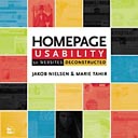
Jakob Nielsen has been supporting his book, Homepage Usability: 50 Websites Deconstructed, with a few of articles on homepage design. I took the opportunity to make some changes to my own site after reading them.

The first article, Top Ten Web Design Mistakes of 2003, lists what’s been annoying him recently. I did well on this one—I only needed to add some ALT text to my images (Tip #5 is Overly detailed ALT Text—oops, I actually didn’t have any) and make pages stop linking to themselves (#10). The latter improvement is not directly supported in my CMS tool (CityDesk) and took a fair amount of scripting, but armed with CityDesk keywords and my keyword organizing utility, I got it done.

That article linked to The Ten Most Violated Homepage Design Guidelines. I didn’t do too badly on that one either, but I decided to differently color visited links and make it more clear where you are on the site (#3). I rewrote my tag line to be more informative (#5) and made my tags more descriptive. I was already following #2 (Use a liquid layout that lets users adjust the homepage size), since that’s a pet-peeve of mine.
Finally, I read Top Ten Guidelines for Homepage Usability. By this point, most of the tips were redundant. I haven’t added a search yet, but I’ll do that soon.

The book has over a hundred guidelines sure to improve any site.

The NeverLost UI—Design for the Disengaged User

Last week I had my first experience with a GPS based guidance system, the NeverLost from Hertz. I was struck by some of the good UI choices and want to highlight them here. For a more in-depth analysis, see this evaluation. I will limit this entry to my current blog topic of usability vs. learnability  as it applies to the disengaged user.

The designers of NeverLost certainly had to design for both usability and learnability. Few will have the time or inclination to read the manual once they get to their rental car, and many will be first time or occasional users. More importantly though, the NeverLost must be easy to use. I’m sure the designers of NeverLost understood the possibility of their device contributing to an accident, and let that be the overriding concern in all of their choices. The NeverLost is a good example of designing for disengaged users, that is, users that are doing something else while using your software. The principles of the NeverLost design have wide applicability (e.g. software for call centers or traders).

Here are some of the basic principles they have adhered to:

    1. Constraining choices rather than interrupting on errors: A good choice in any application, the NeverLost takes it to an extreme. Typing is hard (you choose letters by navigating over a pick-list), so the search interface only shows letters that will actually return a result. So, for example, if you pick the letters “H-O-L-I-D” in the Yellow Pages search, only the letter “A” appears on the pick list, because the “Holiday Inn” is the only item in their list that starts with those letters. Searches never fail to return a result, and you can correct errors immediately. Of course, a keyboard or a touchscreen might have made this easier, but they would also add to the cost.
    2. Speech rather than text: Essential for this kind of system since you really should not be looking at it while driving.
  • The display is easy to glance at: While driving, the display is simply the major routes with the current one highlighted and the car showing the driving direction.  It’s very easy to see that you are on the right track.  All other information is via speech.


  • Anticipation rather than waiting for input:  We made two deviations from the directions. The first was missing our exit, and the NeverLost immediately calculated a new route and let us know what it was doing. The second was getting off at an exit to make a rest-stop—in that case, the NeverLost let us get back to the route ourselves without recalculating. Both choices were exactly what we wanted, so we didn’t need to fiddle with the interface.


  • Mistakes are easy to correct: The NeverLost keeps a list of the destinations you have input and lets you easily go back to them. A Cancel button lets you back out of all choices. Having these features lets the NeverLost stay out of your way most of the time, because it knows that you can revert to an old state when you need to.


All of these are good ideas for any interface, and if you imagine that your user is distracted, your user interfaces will be even easier to use when they aren’t. Of course, a speech interface is not right for all applications, but sounds usually are, and can help to alert users when their attention is required.
When conducting usability tests, keep in mind the environment your users are in, and try to match it. For example, don’t gather users to your pristine environment. Go to them if you want to see how they really use your software and the distractions they encounter.

Usable and Learnable

Usable interfaces are all about productivity for those that use your software every day. They feature a UI that anticipates you, but gets out of your way and ensures that your mistakes are recoverable.

Novices require more hand-holding. They may either be new to the application and not yet a power-user, or they may be an occasional user, or they may be watching a demo. In each of these cases, the application must be easy to learn and understand.

When you prepare your user profiles for a UI Design or a product requirements document, it may seem that these two user types are hopelessly irreconcilable, and sometimes you’ll specify two completely separate UI’s (e.g. wizards in addition to the “normal” UI). Sometimes this is appropriate, but on his blog, Philip Brittan discusses a product we worked on, where features supporting both types were implemented with the same UI.

Usability vs. Learnability

I just needed to look up something in User Interface Design for Programmers by Joel Spolsky and I was reminded of a great chapter on usability testing (only in the print version). One of the insights is the difference between “usability” and “learnability”. He revisited it in another post.

For casual users, learnability and simplicity are more important than usability and power. In that sentence, by “learnability,” I mean, the ability for novices to figure out how to get tasks done rapidly. By “usability,” I mean only the ability to do tasks in a convenient and ergonomic way without making mistakes and without needing to do repetitive tasks. A data entry system that minimizes keystrokes by prefilling things and automatically jumping from field to field is more usable for experienced users, but it’s harder to learn because it behaves unexpectedly to a novice.

The book is worth picking up if you are planning a formal usability test, just to see what kind of things to look for, and what to expect to accomplish. Keep in mind, that if your testers are seeing the UI for the first time, you are testing learnability, not usability.

FitNesse and Requirements in XP

In XP, requirements gathering is an ongoing conversation validated with acceptance testing. It makes sense, therefore, that any document that results from gathering requirements be easy to edit and give explicit instructions for validation. FitNesse takes this idea to the extreme by using a Wiki front-end to make the requirements document the living, growing entity it needs to be, and it builds in FIT acceptance testing, so that tables representing acceptance tests can be added and run directly from the document.

To use FitNesse, developers add Fixtures to their projects using the FIT framework. These Fixtures can be are added to FitNesse using path and fixture directives. Each page can embed an acceptance test using syntax like the following:

|!-CalculatorColumnFixture-!|
|button|display()|
| |0|
|1|1|
|+|1|
|2|2|
|=|3|

This example tests a calculator by pressing its buttons. CalculatorColumnFixture is a class extending ColumnFixture in FIT.  It has a member variable called button and a method called display().  For each row, button is set to the value in the left column and the return value of display() is checked against the value in the right column. In addition to this table, any text describing the functionality of the calculator can appear on the page. Advanced Fixtures are available for more complex interfaces.

The beauty of FitNesse is that it is implemented as a web-server that serves up the Wiki with the requirements documentation and acceptance tests. It adds FIT directives to the normal Wiki editing syntax and includes version tracking for each page.

Combining the aspects of collaborative document growing and automated acceptance tests, FitNesse is a great addition to the requirements process.

Keyword Picker for CityDesk

I use CityDesk to manage this site. One of the features is that each page can be tagged with keywords. The problem is, however, that the keywords are typed into a TextBox, not chosen from a List. I am having problems remembering all of the keywords I have decided to use, but I want to be consistent, because I plan on making pages for each keyword when I have enough blog entries (to help organize the archive page).

I wrote a small program to help me do this.  If you have the same problem, check it out.

Here’s a screenshot

  • Add keywords by typing then in, and then clicking the Add button.
  • Put keywords into the clipboard by checking the ones you want and then clicking the Copy button.  Then go to CityDesk and paste them into the keywords TextBox on the Properties tab of the article.
  • Delete keywords by checking them and then clicking the Delete button.
  • Keyword Picker is set to be always on top of other windows so you can overlay it on a full screen CityDesk while you work.
  • Make sure to read the CityDesk help page titled Using Keywords Effectively.

To Install:

  • Download KeywordPicker.zip  (current version: 1.2)
  • Extract KeywordPicker.exe to anywhere you want
  • Run from anywhere, keywords are stored in the registry

Keyword Picker for CityDesk is provided as-is and with no support. E-mail questions, comments, requests via our contact page.


Update
: Cool. Five minutes after posting this, it’s already in TK’s CityDesk Help Reference—which, by the way, has some good stuff for CityDesk users.